As a Mac user I naturally focus on that platform, but Windows 11 has had its own share of problems – and that list has grown so vast it’s hard to know where to start.
So let’s pick it up at random, with a post by Thom Holwerda with a great title “You can actually stop Windows Explorer from flashbanging you in dark mode”:
One of the most annoying things I encountered while trying out Windows 11 a few months ago was the utterly broken dark mode; broken since its inception nine years ago, but finally getting some fixes. One of the smaller but downright disturbing issues with dark mode on Windows 11 is that when Explorer is in dark mode, it will flash bright white whenever you open a new window or a new tab. It’s like the operating system is throwing flashbangs at you every time you need to do some file management.
I find the videogame-inspired nickname darkly – I’m sorry! – funny, but the problem is real. It looks like this (video via windowscentral.com):
It’s not a problem unique to Windows 11 – just the other night I saw this on Wikipedia on my iPhone, exacerbated by the delayed reaction of Liquid Glass buttons spastically adapting to the changing background:
But there is something about this that feels a notch more important than other visual and layout issues.
I think this is because dark mode is a contract – we’ll lower the brightness, and we’ll let your eyes rest. There’s a physiological part to it: a sudden flash of light when your eyes are not expecting to it can be actually physically painful. I think it’s worth thinking about it and futureproofing and sanding dark-mode views especially at their edges: loading states, error messages, signing in and logging off areas. The “flashbang” analogy is very apt, and especially so on bigger screens.
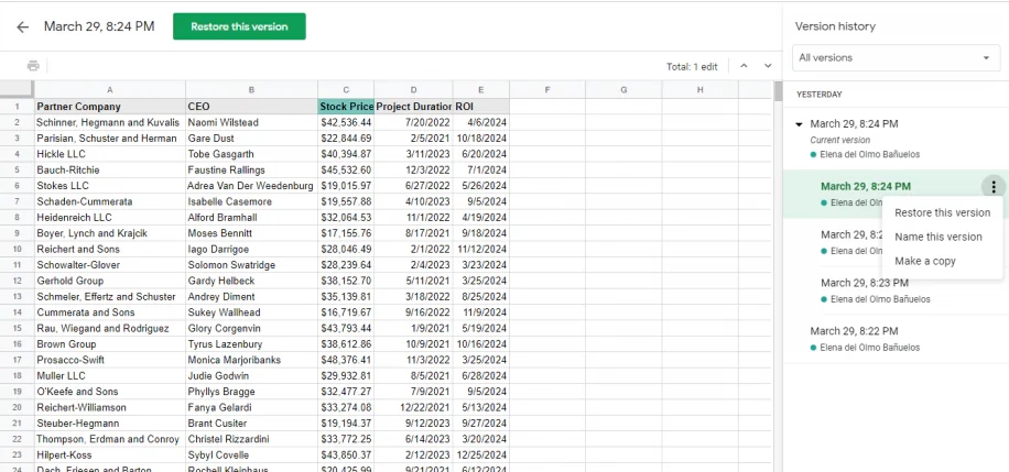
I have been enthralled with this tiny feature in Google Sheets called “Show edit history,” which premiered in 2019:
Mind you, it’s not unconditional love. The execution feels a bit clunky, showing the edit values in a pop-up rather than in situ, with formatting that feels too heavy, and an awkward “No more edit history” state rather than just disabling the button.
But! Just its very presence here is delightful. Version history is often this huge, comprehensive, perhaps disorienting mode you enter that by design deals with the entire file. It always feels like a longer trip:
But edit history reimagines the feature from the perspective of the cell. You can just peek inside, quickly and effortlessly. Right click menu, a few arrows, I learned what I needed, and I barely even moved my hand. It’s a perfect example of the rule “to make something feel faster, make it smaller.” It’s like picking your newspaper at your doorstep in your pajamas rather than having to dress up to go to the newspaper store.
(…he said, dating himself and perhaps also thinking of The Sopranos for some reason.)
This kind of reimagining of something that already exists (see: undo send in Gmail) can be really hard, and I don’t even imagine Google Sheets was the first with this idea – but for me seeing this remix was eye-opening, and it inspires me to this day.
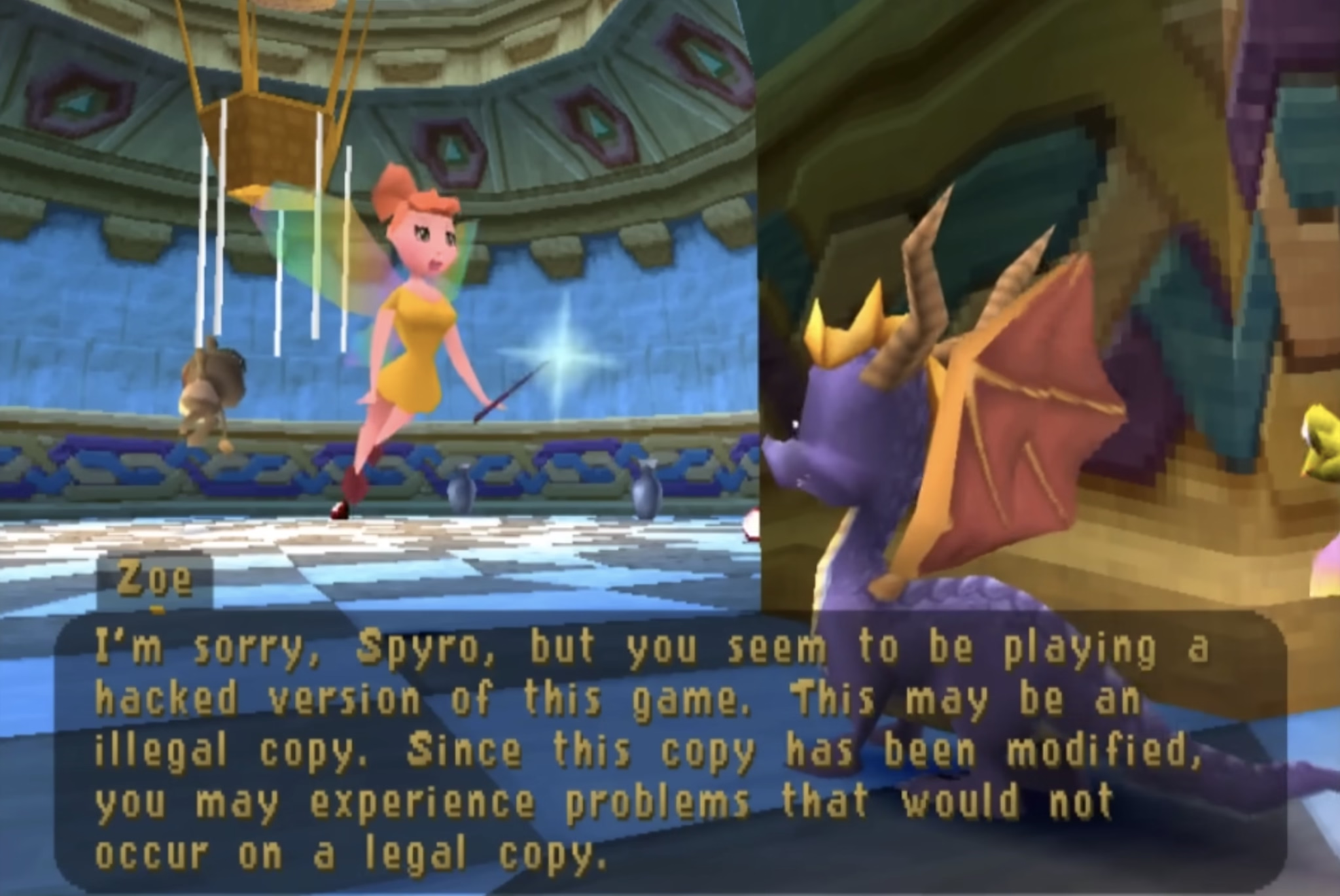
I’m not going to spoil the surprise. Am I fully supportive of the approach? Not sure. PlayStation’s region protection complicates my feelings, and any sort of DRM-esque approach eventually backfires when it comes to software preservation. But you can’t deny what Spyro developers did is a really fascinating and weird approach.
The quote in the title of this post refers to the hackers who eventually did conquer the Spyro’s copy protection system. I guess – and I apologize in advance – game recognize game.
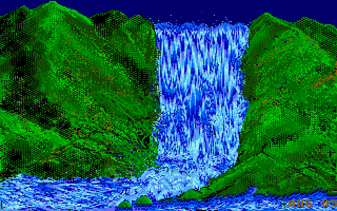
Palette cycling is an interesting technique borne out of limitations of old graphic cards. Today, any pixel can have any color it wants. In the 1970s and 1980s, you were limited to just a few fixed colors: as few as 2 for monochrome displays, or 4, or 8, or – if you were lucky – 16. Some of those fixed palettes, like CGA’s, became iconic:
But there was an interesting hybrid period in between then and now where you still were only allowed 4 or 8 or 16 or 256 color choices in total, but you could assign any of these at will from a much bigger palette.
So, as an example, each one of these three is made out of 16 colors, but each one is 16 different colors:
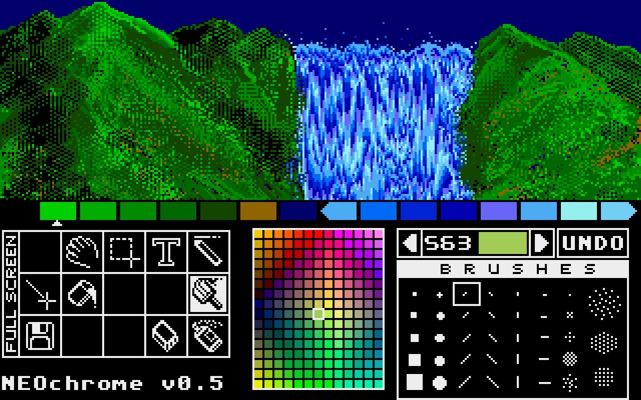
Moving pixels was slow. But palette swaps were so fast and easy, that it led to a technique known as palette cycling. This is probably the best-known example, from an Atari ST program called NEOchrome.
Despite so much apparent movement, no pixels are changing location, as that’d be prohibitively slow in 1985. Only the palette is changing. If you watch the same animation with the UI visible, you can clearly see which colors are “static,” and which are moving around:
But this was 1985, so why I am mentioning it 40 years later?
I like looking at old computers for a few reasons. Some of these seeminly-ancient techniques are inspiring and remind me that the limitations are often in the eye of the beholder. Seeing someone really good pushing a platform to its limits is just a good thing to load into your neurons – this could be you next time! And, believe it or not, some tips and tricks can still be relevant.
For example, this is a 9-minute video by Steffest from just earlier this year that walks through a modern attempt to make a palette cycling animation, including starting on an iPad:
The end result goes much harder than I expected. It was interesting to see again the technique of dithering to simulate transparency (we’ve seen it before, but this one is more advanced). But what particularly stood out to me here was the artist making his own little tools to aid in the creative process; I’ve always loved the notion that a computer is really just meant to be an accelerant, making it easy for you to avoid drudgery.
One of the ways I like to do development is to build something, click around a ton, make tweaks, click around more, more tweaks, more clicks, etc., until I finally consider it done.
The clicking around a ton is the important part. If it’s a page transition, that means going back and forth a ton. Click, back button. Click, right-click context menu, “Back”. Click, in-app navigation to go back (if there is one). Click, keyboard shortcut to go back. Over and over and over. You get the idea.
It’s kind of a QA tactic in a sense, just click around and try to break stuff. But I like to think of it as being more akin to woodworking. You have a plank of wood and you run it through the belt sander to get all the big, coarse stuff smoothed down. Then you pull out the hand sander, sand a spot, run your hand over it, feel for splinters, sand it some more, over and over until you’re satisfied with the result.
This is a clever metaphor and I wish I thought of this before. What follows is a specific story of finding a few dead pixels in between related interface elements, which is an absolutely perfect example of something with non-linear frustration: It might not register at all on the first try, but it will bother you 1,000-fold on the 20th go.
I was just on Internet Archive earlier today, uploading some documents I scanned this weekend. Their UI is… how would I put this… let’s just say Internet Archive makes Teams feel like Linear. (I love Internet Archive and their work and mission, but let’s be honest here.)
Yet, I found something marvelous. Whoever put the upload form UI together knew there will be people like me who’ll be filling out 20 of these forms one right after another. So they made sure every pixel in their form is clickable to edit the nearest field. And I mean, every pixel.
Whoever you are, you have my nod of recognition. In at least this one respect, it’s clear someone spent a lot of time with the sander.
My post about Flickr URLs gathered some interesting responses (especially on Mastodon, thank you all!), so I thought I’d do what podcasts call a “mailbag episode”!
Some people pointed out other good examples for inspiration. Chris Silverman:
The idea of URLs as user interface elements is such a good take. I’ve seen some people use URLs as design/communications elements as well, like Jessica Hische:
www.jessicahische.is/thinkingthoughts
www.jessicahische.is/working
jessicahische.is/anoversharer
I love that approach. Modern browsers and preview cards often obscure URLs, but people still see these things; printed materials, links in emails, etc.
Matt Goldman:
I really like letterboxd’s urls these days:
all the films in my diary in 2024? letterboxd.com/robotmlg/diary/films/for/2024/
movies I’ve tagged as seeing at Film Forum? letterboxd.com/robotmlg/tag/film-forum/films/
five star reviews that I wrote in 2021? letterboxd.com/robotmlg/reviews/films/for/2021/rated/5/
Both Erin Sparling and Nelson Miner highlighted how much the craft of Flickr URLs related to the craft of its API:
Literally used to talk about how good this URL scheme was in class, it was so informative. The Flickr API still informs everything I do these days, URLs included.
There was some discussion about the pattern I suggested. Which one should it be?
I will admit: I don’t know. Each has pros and cons – some are better for autocomplete, others better for conveying hierarchy or surviving “removing from the end.”
This note arrived via email:
Hey, www is not redundant. In services like NextDNS it allows blocking only main site, without subdomains. So it gives more control and cost nothing :)
To which my answer is: I don’t think you’ll get to great user experience by prioritizing corner cases like this one.
Jim Nielsen shared some of his favourites, and Søren Birkemeyer suggested more evergreen reading on the subject, with more inspiration inside:
The middle one caught my attention because it talks about URLs that are not just user readable, but also user guessable. I think that’s a perfect word for something I tried to capture in my post: if a user successfully guesses a URL from your scheme, then you know you have something good on your hands.
Lastly, a few people mentioned the late 1990s classic written by a relatively unknown dude going by “Tim BL,” called Cool URIs don’t change.
Historical note: At the end of the 20th century when this was written, “cool” was an epithet of approval particularly among young, indicating trendiness, quality, or appropriateness. In the rush to stake [out] DNS territory involved[, ] the choice of domain name and URI path were sometimes directed more toward apparent “coolness” than toward usefulness or longevity. This note is an attempt to redirect the energy behind the quest for coolness.
It is incredible how far we have come for these barely-distinguished placements to be called “visually separated”. Google’s ads, for example, used to have a coloured background, eventually fading to white. The “sponsored link” text turned into a little yellow “Ad” badge, eventually becoming today’s little bold “Ad” text. Apple, too, has made its App Store ads blend into normal results. In OpenAI’s case, they have opted to delineate ads by using a grey background and labelling them “Sponsored”.
Now OpenAI has something different to optimize for. We can all pretend that free market forces will punish the company if it does not move carefully, or it inserts too many ads, or if organic results start to feel influenced by ad buyers. But we have already seen how this works with Google search, in Instagram, in YouTube, and elsewhere. These platforms are ad-heavy to the detriment and frustration of users, yet they remain successful and growing. No matter what you think of OpenAI’s goals already, ads are going to fundamentally change ChatGPT and the company as a whole.
For a few months now, when re-running search queries in Bluesky’s iOS app, I ended up occasionally arriving on the wrong search, and it happened enough that I started suspecting something’s afoot. (Ahand?)
So I opened the app on my Mac via iPhone Mirroring, and started clicking testing carefully. This is what I saw:
Turns out there was something wrong there – the touch targets are so vertically lopsided you’ll often end up tapping the item below by accident.
This is a nice way iOS Safari behaves the moment you tap one of the font size buttons – it immediately ejects all the other chrome:
After Liquid Glass specifically, we seem to be going through an interesting re-evaluation of whether “the content is the king; it should feel expansive and UI should get out of the way at all costs,” so seductive as a principle, is ultimately the right approach. Liquid Glass-sporting operating systems have so many contrast and blending and distraction issues that I wonder if they alone are radicalizing people, making them appreciate traditional rigid toolbars with solid backgrounds and fortified borders.
But here? Here letting contents shine and putting the UI atop feels like the absolutely right thing to do, since you are redesigning your reading experience.
Contrast this with Books:
It’s not even that the crossfaded transitions feel awkward. It’s mostly that the interface takes up so much room that the content preview slice becomes almost claustrophobic. And it’s even weirder when you tap the Customize button, and whatever was visible gets inexplicably replaced by a pop-up with… largely the same content anyway.
How will the entire page feel? For that you have to use your imagination – or keep tapping back and forth.
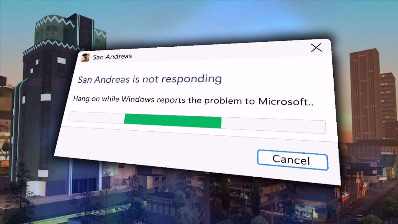
San Andreas was released in 2004, but the game started breaking only after Windows got updated… in 2024. Turns out the bug was sort of a ticking time bomb just waiting for the right set of conditions. We covered one similar bug before, in Half-Life 2 – but this investigation goes deeper, and shines a light on the difficulty of making Windows, whose backwards compatibility comes at a price.
This was incredible and a breath of fresh air. No redundant www. in front or awkward .php at the end. No parameters with their unpleasant ?&= syntax. No % signs partying with hex codes. When you shared these URLs with others, you didn’t have to retouch or delete anything. When Chrome’s address bar started autocompleting them, you knew exactly where you were going.
This might seem silly. The user interfaceof URLs? Who types in or edits URLs by hand? But keyboards are still the most efficient entry device. If a place you’re going is where you’ve already been, typing a few letters might get you there much faster than waiting for pages to load, clicking, and so on. It might get you there even faster than sifting through bookmarks. Or, if where you’re going is up in hierarchy, well-designed URL will allow you to drag to select and then backspace a few things from the end.
Flickr allowed to do all that, and all without a touch of a Shift key, too.
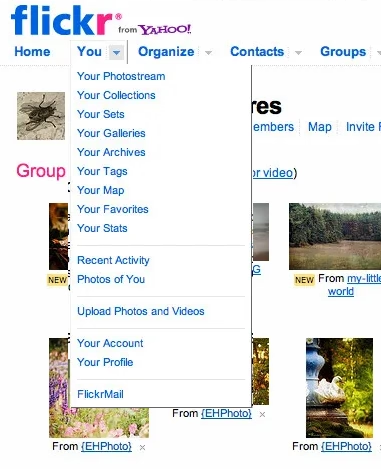
Any URL being easily editable required for it to be easily readable, too. Flickr’s were. The link names were so simple that seeing the menu…
…told you exactly what the URLs for each item were.
In the years since, the rich text dreams didn’t materialize. We’ve continued to see and use naked URLs everywhere. And this is where we get to one other benefit of Flickr URLs: they were short. They could be placed in an email or in Markdown. Scratch that, they could be placed in a sentence. And they would never get truncated today on Slack with that frustrating middle ellipsis (which occasionally leads to someone copying the shortened and now-malformed URL and sharing it further!).
It was a beautiful and predictable scheme. Once you knew how it worked, you could guess other URLs. If I were typing an email or authoring a blog post and I happened to have a link to your photo in Flickr, I could also easily include a link to your Flickr homepage just by editing the URL, without having to jump back to the browser to verify.
Flickr is still around and most of the URLs above will work. In 2026, I can think of a few improvements. I would get rid of /photos, since Flickr is already about photos. I would also try to add a human-readable slug at the end, because… flickr.com/mwichary/sets/72177720330077904-alishan-forest-railway
…feels easier to recall than… flickr.com/photos/mwichary/sets/72177720330077904
(Alternatively, I would consider getting rid of numerical ids altogether and relying on name alone. Internet Archive does it at e.g. archive.org/details/leroy-lettering-sets, but that has some serious limitations that are not hard to imagine.)
But this is the benefit of hindsight and the benefit of things I learned since. And I started learning and caring right here, with Flickr, in 2007. Back then, by default, URLs would look like this:
Flickr’s didn’t, because someone gave a damn. The fact they did was inspiring; most of the URLs in things I created since owe something to that person. (Please let me know who that was, if you know! My grapevine says it’s Cal Henderson, but I would love a confirmation.)
Shadeed argues that this ugly responsive interregnum happens a lot more than people might assume, as part of natural window management on larger screens. If you un-maximize the window, use one of the many split-screen features, or something like link preview, it might push the browser into a width slice you might have thought was not actually realistically occupied.
Also, what caught my attention at the bottom of the post was this smart visualization. I wish the responsive design features in my browser’s web inspector did this kind of thing automatically:
★★★★★ (as books)
★★★★☆ (for the purposes of this blog)
I still remember Mac OS X arriving on the scene with icons that felt infinite in every possible way: in size, in color palette, in dimensionality. We got used to them over the last quarter century, but Michael Flarup’s books rekindled that feeling for me; the icons presented here are lavish, larger than life, and basically pixel-less.
I do not generally like coffee-table books. But I really liked these. The iOS App Icon Book came out in 2022, and the macOS App Icon Book followed two years later. They’re “almost-coffee-table” – which is a compliment! – extremely well-made but portable, and with soul, and thoughtful details, and inspiring evidence of being labours of love.
Each one has an almost-absurd amount of icons (I counted almost 1,200 in one book, and consequently didn’t even attempt counting in the other), but it’s not just the quantity that impresses. The icons are laid out carefully on gorgeous color-coordinated spreads. Many appear in variations so you compare their evolution over the years. Each one is big enough and printed so well you can study it in detail, and I have not noticed one technical flaw in their reproduction.
In addition to beautiful collections of beautiful icons, the book also veers a bit into history, and design advice, and adds ~10 interviews with icon designers each. Those are welcome additions that elevate the books from a boring coffee-table existence, but those are also its weakest parts – although “weakest” in a comparative sense. The things missing for me in the book are: more work in progress and rejected efforts, more specific advice and hard-learned lessons rather than general-interest interviews, a bit more about recognition of icons when reproduced small on screens, and some harder/cerebral conversations about iconography and its place in the universe.
On the other hand, I know that of all icons it’sapp icons that get to be least concerned with semantics and semiotics, as they’re maybe the closest to just pure art and graphic design. I can understand how talking through it all would be an extremely hard task; all of the fantastic icon designers I know personally would struggle with explaining why their output is better than others. It’s possible the extra “left-brain” stuff I want from these books would also make them less desirable for those who just seek visual or artistic inspiration.
Both books are otherwise basically a love letter to app iconography, and awash in memorable details: delightful covers, colour-coordinated ribbon bookmarks, beautiful ex librissen, and a product index and an artist index.
The price – $84 without shipping (they’re printed in Denmark, so for once Europe gets an advantage) – might be a bit of a showstopper. The books are well-made, but you are definitely paying a premium for a short/bespoke print run. The volumes complement each other well on a shelf, but you’ll do no wrong with getting either one if two is too much for your budget. (There is also a half-price PDF version, if that’s of interest to you, but I cannot vouch for that.)
Another good post from Roger Wong thinking through Anthropic’s findings on how offloading coding effort leads to understanding less:
So the AI group didn’t finish meaningfully faster, but they understood meaningfully less. And the biggest gap was in debugging—the ability to recognize when code is wrong and figure out why. That’s the exact skill you need most when your job is to oversee AI-generated output.
Inside it, a quote from the Anthropic post that resonated with me:
Cognitive effort—and even getting painfully stuck—is likely important for fostering mastery.
I wonder if part of the appeal of AI tools is the promise of “exercise without exercise,” like the vibrating belt machines of the 1950s.
Writing at speed privileges what arrives first. The obvious phrasing, the familiar structure, a thought that you heard somewhere before.
Also this:
A book is not retrieved fully formed from memory, or pulled up in a full bucket from some deep creative well in your body.
The old saying goes “everyone dreams about having written a book, not about writing one.” Now we’re building software that allows people to “have written a book” and “have designed something.”
I am open (I think!) to the idea that the nature of the effort will change as tools change. But I can’t see mastery arriving without effort. And I’m worried people will start mistaking prompting mastery for material mastery.
I was randomly checking the Wikipedia entry for killer apps – apps that were so good that they single-handedly made people buy a particular hardware platform just to run them (Wii Sports for Nintendo Wii, Super Mario 64 for Nintendo 64, and so on).
There are some interesting nuggets in there I didn’t know, like Sibelius (music software) being a system seller for the British computer Acorn Archimedes, Xevious doing the same for Famicom (I had no idea Xevious, as beautiful as it is, was so huge!), and Steve Jobs focusing so much on making calls on the first iPhone. How quickly we started taking visual voicemail for granted…
But I was suprised not to see killer apps for Fortnite, Minecraft, Roblox, or even Mac OS X. Does the concept of killer apps not work anymore? Is iMessage a killer app for those who want blue bubbles, but it’s much harder for us to know that?
(I’m also curious about a parallel list of botched updates: Digg in 2010, Sonos in 2024, the “simplified” iMovie ’08 and Final Cut Pro X, Liquid Glass, as some of them ended up being anti-killer apps. I don’t immediately see anything like this online, but it could be an interesting series of posts to analyze those more carefully, going past schadenfreude or ridicule.)
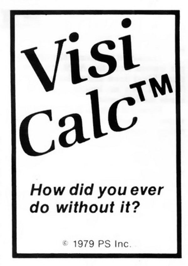
Also, it made me think of one of my favourite ads. It’s for VisiCalc, the first computer spreadsheet, and the first-ever killer app. The ad was unassuming, small, in a corner of a 1979 computer magazine. But, in hindsight, what a prescient and brilliant question: How did you ever do without it?
We take spreadsheets for granted, too, but chills. Literal chills.
I was embarrassed for Apple when I saw the recent bug fix for columns introduce a new bug, explained in this post by Jeff Johnson:
Without the path bar, the columns are now taller, but the vertical scrollers remain the same height as before, leaving vertical gaps, a ridiculous amount of space between the bottom of the scrollers and the bottom of the columns, looking silly and amateurish.
It’s impossible to talk about craft without talking about embarrassment, and pride, and shame, and lust, and a lot of other words – all tricky to describe, all fluffy. So, I tried to interrogate my feelings.
First, it was embarrassing that it broke. I’ve been there: you build a complex system, and forget about some lesser-known state. That’s why it’s important to invest in whatever it takes to shine a light on those states: quality assurance, automatic screenshotting, tests, and so on. Sometimes it’s simple hacks – like half of your team having scrollbars visible. And when you notice a bug, you try not to just fix it, but to rebuild it to be stronger (“leave the campsite in a better place you found it”) – be it by fixing the cause and not just the symptom, adding unit tests, changing practices, and so on.
But it also felt embarrassing how it broke. It feels clear there’s some manual calculation going on somewhere, and someone forgot to add this new change to it. One of the tricks I learned over time is that a well-designed system designs itself, but it takes effort and imagination to make a system resilient in this way. Here, if there was some abstraction of “adding stuff to the bottom,” then you wouldn’t have to worry about adding extra math. The system would take care of itself in many of these corner cases you will forget about.
I don’t want to shame (see, that word again!) individual people at Apple because I don’t know if it’s the lack of talent, or the whole system being wired in a way that doesn’t reward forward thinking or the kind of invisible work that needs to happen in those spaces. But the embarrassment should be there – if it doesn’t exist inside Apple, then that’s perhaps the sign of a real problem.
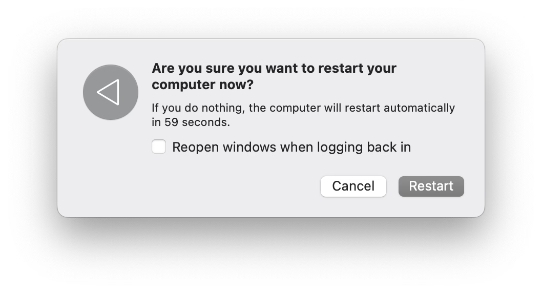
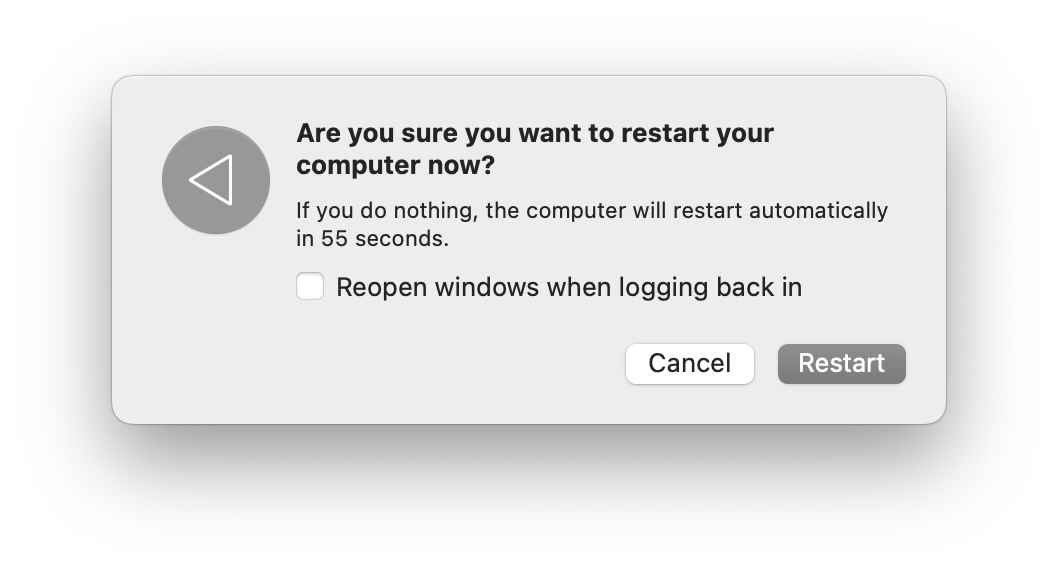
Old-school computing has a term “molly guard”: it’s the little plastic safety cover you have to move out of the way before you press some button of significance.
Anecdotally, this is named after Molly, an engineer’s daughter who was invited to a datacenter and promptly pressed a big red button, as one would.
Then she did it again later the same day.
You might recognize molly guards from any aerial combat movie you ever watched:
And some vestigial forms of molly guards exist everywhere in civilian hardware, too: from recessed buttons, through plastic ridges around keys, to something like a SIM card ejection hole.
Of course, molly guards happen in software, too: from the cheapest “are you sure?” dialogs (which sometimes move buttons around or disable keyboard activation to slow you down), through extra modifier keys (in Ctrl+Alt+Del, the Ctrl and Alt keys are the guards), to more elaborate interactions that introduce friction in places where it’s needed:
But it’s also worth thinking of reverse molly guards: buttons that will press themselves if you don’t do anything after a while.
I see them sometimes, and always consider them very thoughtful. This is the first example that comes to my mind:
Here’s what became a standard mobile pattern:
These feel important to remember, particularly if your computer is about to embark on a long process to do something complex – like an OS update or a long render.
There is no worse feeling than waking up, walking up to the machine that was supposed to work through the night, and seeing it did absolutely nothing, stupidly waiting for hours for a response to a question that didn’t even matter.
It’s good to think about designing and signposting those flows so people know when they can walk away with confidence, and I sometimes think a reverse molly guard could serve an important purpose: in a well-designed flow, once you see it, you know things will now proceed to completion.
The UI for filing bugs is inscrutable and has too many hoops to jump through.
No one does anything unless every field has been filed meticulously and there is a clear repro.
The designer is ridiculed if the thing isn’t actually a bug, is a duplicate, or if it was filed in the wrong place.
Front-end bugs are automatically “minor” or “nice to have”s without listening (as there is no loss of functionality, and no data loss).
The designer is always responsible for stating how it should work, without being able to say “I am not sure why, but this started feeling off and it’s in an important place. Can we investigate?”
“This is as designed” is an automatic conversation ender.
The tiniest of external reports, social posts, or blog posts, immediately are prioritized higher than in-house experience.
Once every few years, a designer gets 20+ demotivating automated emails saying 20+ bugs they filed over the years have been closed automatically during a purge, without any word of explanation.
Simple human touches like “thanks for filing!” or “nice catch!” never enter the picture.
Engineers never file design bugs themselves.
If you’re an engineer, I can sense you might be getting frustrated, as most bullet points I listed look like extra work. I agree with you. It is. This post is as much about process, as it is about culture and the incentives it establishes. The best places I’ve worked were filled with shared trust and treated bugs as a joined responsibility of everyone, rather than a black-and-white division into “filers“ and “fixers,” with the ultimate end goal always being user’s experience – nothing else.
I also understand this dives right into an age-old tension between manufacture and craft. Bug-fixing processes have to be well-oiled bureaucracies with very specific rules so that they don’t turn into a pile of vibes and Brownian motions. But design (and, by extension, a lot of front-end) doesn’t work like that. Design needs room for taste, for careful exceptions, for escalation of immesurable things, and for a certain flexibility in even the basic definitions.
If it’s a tiny, but embarrassing bug, or a flow killer, or a thing that bothers your most valuable group of users, or something appearing in a well-trafficked place – it is no longer tiny. If it’s working as intended, but it feels buggy to the user – it ought to be a bug. If it’s a long-standing bug, it should be considered as cumulative damage already done, not “oh, this has been like this for a long time, no one cares.” If there’s a shaky repro, but the bug feels important, you need to work from principles or analyze the code. If it’s something no one mentioned externally (ergo: why fix it?), consider a lot of bugs rankle but never get reported, particularly if your company doesn’t project an external presence of caring about feedback and acting upon it. cough cough Apple cough cough cough cough cough dies coughing
Of course, designers have responsibilities in the process also, among them mutual respect and understanding of engineering, clarity of communication (particularly about things that are hard to reason about mathematically), seeing patterns that could be grouped into bigger bug bundles to make fixing more efficient, (occasionally!) helping figure out a fix if the obvious fix isn’t available, and shared understanding with their team about what actually matters. There is always a thousand details that could be better, but for every thousand only a hundred might actually be worthwhile. Flooding the bug process with irrelevant minutiae that won’t realistically ever be fixed is not very helpful.
This is the only way I know of to capture the full spectrum of bugs that ruin software – from front-end to back-end, from visual/interactive quality to works-or-not functionality, from what can be measured to what never will be. And this is not just about designers, of course. It’s not even about any non-engineering function. Design serves everyone; if your bug-filing UI or your process or your definitions are not well-designed or -balanced, I strongly believe you’re also hurting engineers on your team. And you’re definitely hurting your users.
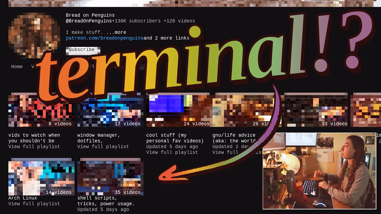
I am pretty sure this is nothing new for heavy command-line gurus (and heavy Raycast users, and so on), but I found it delightful to see someone so excited about creative uses of the terminal, and it made me realize how much time I do waste going through the browser, then Google Search, then scrolling. I am sure tightening some of these loops would feel great.
There is also something interesting in the argument about terminal being the ultimate “reading mode” of any website, chiefly because it cannot be anything else.
Mostly, this and Strudel before make me excited to see some new (to me) stuff happening with text-based user interfaces.
But it also made me think. I still strongly associate macOS shake with “wrong password,” meaning “you’re doing something wrong” – something the system has been teaching us ever since the late 1980s NeXT computer, whose windowing manager it inherited. Am I careful about the motion vocabulary and the semantics of shake, or am I simply overthinking it? Sometimes it is hard to tell.
(By the way, is it okay for me to link to random work by strangers, or is it weird? Don’t be afraid to let me know. One thing I want to practice on this blog is various ways to be a critic, in the sort of Roger Ebert sense.)
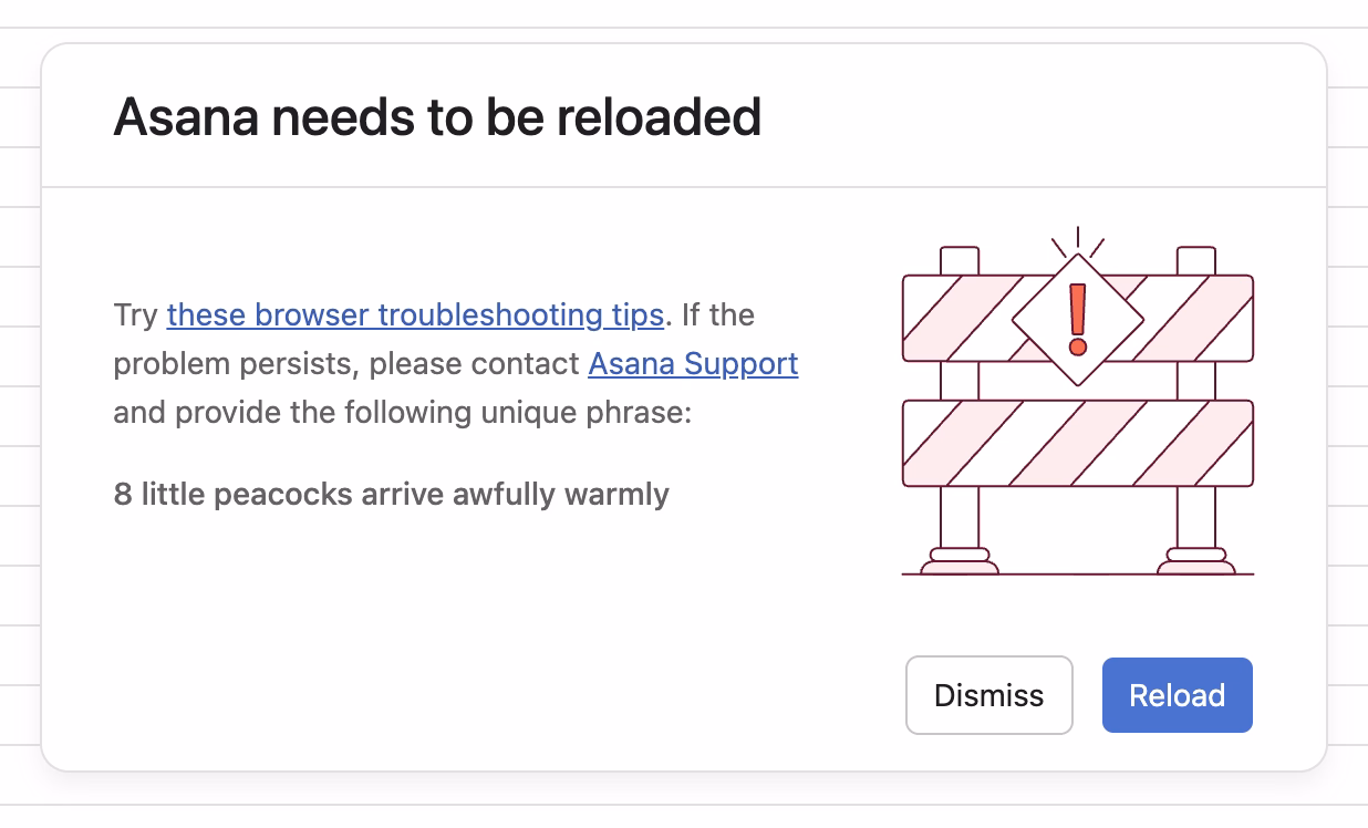
I spotted this interesting thing at work today, and was curious about that phrase at the end:
Turns out, it is basically a unique human-readable encoding of a 32-bit digit, I’d guess particularly for ease of voice/phone support communication. (Otherwise I imagine copy/paste would work well?)
What is novel in Asana is the form these IDs take. In most other applications, a customer-facing ID is usually a long jumble of numbers and/or letters. There are lots of small, subtle drawbacks to representing a number to a human this way, and so for the sake of curiosity—and to add a little levity to an otherwise frustrating situation—we tried something different.
Imagine representing 32 bits of information (numbers up to 4 billion) as a sentence instead of a jumble of digits. One possible sentence structure can be: count + adjective + plural noun + verb + adverb, e.g. “6 sad squid snuggle softly.”
I am very curious what data gets encoded this way since 32 bits is not really a lot. That detail, however, is not covered in the post.
When the project succeeded, her work had dissolved into the project’s infrastructure. The doc was just “the doc.” The tracker was just “the tracker.” The alignment was just how things were. People forgot it had ever been otherwise. That’s the thing about good coordination. I’ve realized that when it works, it disappears. You can’t see it precisely because it worked.
Even though Pandya didn’t call that out, it’s worth highlighting that his “founder friend” example wasn’t a woman by pure chance; often the invisible work becomes the second shift of women in the workplace. And then:
The problem is that recognition follows narrative. When a project succeeds, credit flows to the people whose contributions are easy to describe. The person who presented to the board. The person whose name is on the launch email. The person who shipped the final feature. These contributions are real, I’m not diminishing them. But they’re not more real than the work that made them possible. They’re just easier to point at. Easier to put in a slide. And I think that’s where the unfairness starts, slowly, without people really noticing.
However, I disagreed with these parts:
There’s no framework that fixes this. You can’t design a rubric that captures “held the project together.”
Wait, why not? This is a similar challenge to quantifying design contributions (some of which might not clearly map to KPIs or sometimes even OKRs). You can’t measure being in the flow, true user satisfaction and frustration, or world-class-adjacency of taste. But it doesn’t mean you cannot design a system or a rubric that recognizes and talks about them.
I learned from Diana Berlin’s always excellent newsletter Diagonal that Stewart Brand has a new book out, and it’s about maintenance, and it’s published by Stripe Press. From the introduction:
This book, I’m pretty sure, is the first to look at maintenance in general. It asks: What can be learned if you think about all the varieties of maintenance at the same time? I doubt if there are any non-trivial “laws” of maintenance to be discovered. All I can offer here is to muse across a representative sample of maintenance domains and see what emerges.
Very excited to give it a go, somewhat worried about “Part One” appearing in the title, disappointed in Stripe not caring enough to ask one woman for a blurb.
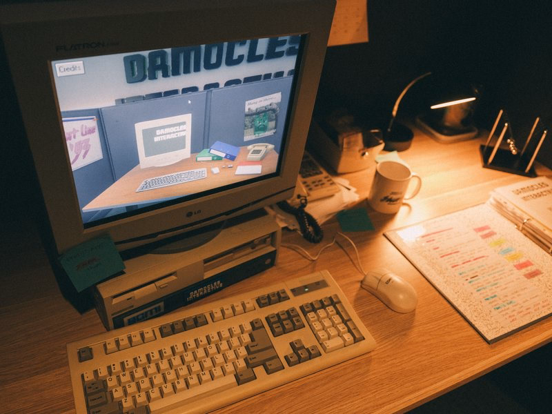
This is incredible – a story of a museum exhibit that replicated an experience of being a tech support person for a videogame company some time in the early 1990s:
You knew hint lines existed, right? 1-900 numbers, long-distance charges, hoping whoever answers actually knows what they’re talking about. They had incomplete documentation, contradictory notes, whatever the previous shift scribbled down. Nintendo’s Power Line is probably the most famous example. There’s a few great videos floating around about them.
The team invented a few new games (“We weren’t just making a game about hint lines. We were making the games that would’ve required hint lines to exist in the first place”), a few personas, and put together a 300-page realistic binder:
The entire story is so worth a read.
Looking back, we think ACMI said yes because we pitched infrastructure, not nostalgia. If you’re old enough, you probably remember that hint lines existed. We wanted people to experience what it was like to be part of that system.
[…]
Next time you tab over to a wiki page or watch a YouTube guide, spare a thought for hint line counselors of the early 1990s, armed with incomplete documentation, good intentions, and hope that the person on the other end was asking about a game they’d actually played. They were unsung heroes of gaming’s most chaotic era, and now, for a few minutes at least, you can experience their particular brand of helpful desperation firsthand.
The exhibit is still available at ACMI in Melbourne until March this year, “along with a life-size usable corporate cubicle (with a dead plant!) and matching hardware straight from the ’90s.”
You can also play it online, although the team warns: “Online is not the intended experience. Flipping through the physical artifact is half the fun.”
If I remember the story correctly, this was neither a bug, nor an Easter egg, but instead a joke’y punishment for not delivering the correct asset on time.
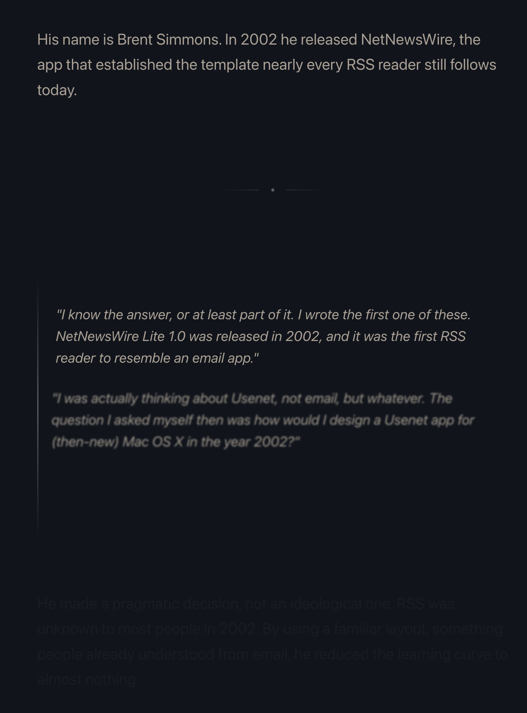
Many people already linked to Terry Godier’s thoughtful essay about email and RSS and the dangers of skeuomorphism by default:
Email is where the metaphor made its jump from atoms to bits. “Inbox” was borrowed legitimacy. It sounded like that wooden tray, so it inherited its psychology. But the wooden tray had a constraint: physical space. A desk could only hold so much. The digital inbox had no bottom. Still, mostly real obligations. Humans writing to you, expecting responses.
This all resonated me, although only to a point. I long stopped paying attention to those unread counters in Gmail and even though I know they exist, they feel wholly meaningless. And I personally would prefer my RSS reader to work more like email, because worrying that I cannot catch up if I wait too long and old entries get recycled is actually adding stress for me.
But I’m thankful for someone else pushing back on the barrage of red dots and fake urgency, and just thinking about it all is worthwhile. I’m very open to the idea of building something that eschews numbers to begin with, and for trying different operating models. (I deleted Threads from my phone after it was pushing me toward the algorithmic timeline filled with outrage, which was detrimental to my mental health.) I could even imagine choosing different RSS feeds to have different rules – this one “cannot miss,” the other one “casual.”
I also want to talk about the essay’s presentation.
The site makes heavy use of scroll effects. Okay, heavy subdued use, but like most of these, this is presentational rather than semantic. In this story at least, it feels a bit more thoughtful and it does feel like it enhances the experience and atmosphere, starting with the ticking number at the very top.
Yet, there are challenges. First, it does seem like there’s a lot of subtle movement going on and at some point that becomes a distraction. Also, I don’t know if it’s a bug or a particular stylistic choice, but things do not reveal themselves until they are almost off the screen. As an example, this is not a screenshot in the middle of animation – this is the page in a resting state, where the bottom is impossible to read:
This property, combined with the fact that all these are always reversible (something that even the recent Death to Scroll Fade page that ridiculed these avoided) makes the essay fiddly and harder to read than it needs to be.
To author’s credit, there is an alternative static version provided and linked to at the very top. But that version is also styled differently, and has more of a “terminal” look.
Thinking out loud and building a set of principles out of these observations, I would personally do it this way:
a static version should be stylistically indistinguishable from the dynamic version
ideally, there would be an easily accessible switch between motion/no-motion, similarly to how some sites allow you to switch to dark/light theme regardless of where you are in the story
if the user specifies “prefer reduced motion” in accessibility settings, a static version should kick in automatically
make the text effects finish as they scroll in, continuing the momentum on their own – don’t make them stop in the middle
unless the animation is particularly important or gimmicky (by the way: I love a good gimmick!), going back and forward again should not replay it
I’m slightly suspicious of this story that Unix commands were made so short (cp instead of copy, mv instead of move, ls instead of list, and so on) because the console keyboard had really unpleasant keys.
I imagine it must be a confluence of many things, not just this one. Shorter means faster even with amazing keyboards. Shorter also means the commands travel quicker over the slow modems of the era. The downsides were limited: the early nerdy user base of Unix could handle the extra confusion.
On the other hand – no pun intended – I typed on the keyboard on the picture and I can confirm it is absolutely, positively atrocious, with the tallest keys you have possibly seen:
At any rate, it’s a good a reminder of the power of motor memory, and the difficulty of change management. Even the worst keyboards imaginable are so much better now, and the modems so much faster. And yet, the short and confusing commands remain to this day.
What makes the AI chatbots and agents feel light and clean, here and now in 2026? Is it an innate architectural resistance to advertising, to attention hacks, to adversarial crud? No — it’s that they are simply new! The language models in 2026 are Google in 1999, Twitter in 2009. Their vast conjoined industry of influence hasn’t yet arisen … though it is stirring.
And I believe their architecture makes them more susceptible to adversarial crud, not less. I suppose we’ll see.
It’s interesting and useful to imagine — really visualize — the chatbots and agents in ten years or twenty … barnacled with gunk … locked in a permanent cat-and-mouse game with their adversaries … just as a platform like Google is today. In 2036, you send your AI agent out into the internet, and it returns battered, bedraggled, inexplicably enthusiastic about a bargain flight to Bermuda.
This is no criticism — just an observation about the way things go.
The AI community tends to say “this is the worst this will ever be” in response to criticism, but in a very learned sense, in many aspects it is also the best it will ever be.
Or maybe, to steal words from another person smarter than me, Ted Chiang:
I tend to think that most fears about A.I. are best understood as fears about capitalism. And I think that this is actually true of most fears of technology, too. Most of our fears or anxieties about technology are best understood as fears or anxiety about how capitalism will use technology against us. And technology and capitalism have been so closely intertwined that it’s hard to distinguish the two.
I remember The Master Switch being an excellent book that taught us how to spot and anticipate these patterns. It might be worth a re-read.
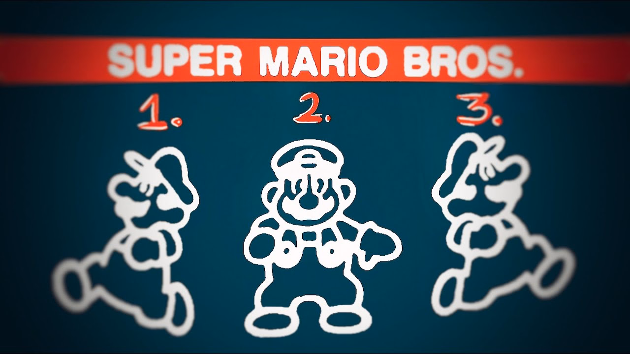
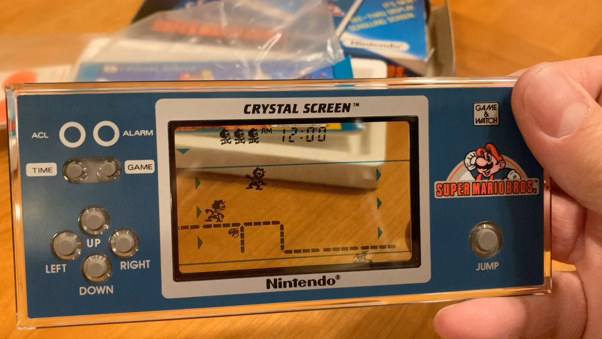
It serves as a bit of design history and even critique of early Mario games, and then in the middle it turns into an analysis of the Mario port on Game & Watch – an obsolete technology even in the 1980s, and something that could have been an easy cash grab, except someone cared.
Translating Mario’s mechanics to a much inferior tech is an interesting design challenge, plus there’s just this universal pleasure of seeing someone go extra. And the video has a nice ending message, too.
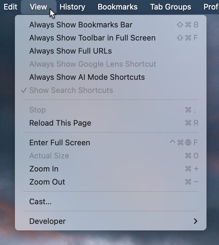
This menu in Chrome feels like a surface running away from its creators:
I think cerebrally I understand the subtle difference between Show and Always Show, but is that difference worth it? Because at some point the repetitiveness and heaviness of that top section is casting a huge shadow over the rest of the menu.
I have an internal rule for adding a new menu item that happens to result in the longest string yet: think about the volume – the literal amount of pixels – you’re adding to the whole surface. Big menus are scarier, wide menus separate items from their shortcuts, submenus become harder to jump into, and so on. The economy of words can benefit in more ways than just the obvious ones.
But what made me a little nervous were the two grayed out options. What does it mean for something starting with Always Show to be grayed out here? What does it mean for something to be grayed out and enabled? My guess is that someone wired these without thinking too much about all the states, but it results in a stressful tension. Software should be making it very clear about what is under my control, and what is not.
Lastly, and this is almost funny: Full Screen is either F or ⌃⌘F, in all standard Mac apps. This alone is already confusing, as is Apple’s entire horrible Globe/Fn strategy (this is a story for another time), and I verified they both work independently in Chrome. How did they get conflated into one shortcut from hell is probably a really interesting bug somewhere – but also a sign no one is seemingly paying attention.
This is neither the first nor the last time I’m sharing David Jonathan Ross’s work; today I want to link to a really fun glyph explorer he put together recently:
That’s it. That’s the tweet. On this blog I generaly want to capture the meaning of well-made things, deeper thinking, going beyond cheap sugary delight, the discomfort of rigor meeting joy and craft coliding with function, and the “why” of it all – and a lot of that is actually all here, too, as long as you keep clicking on things.
But: sometimes it’s also just so nice simply to look at beautiful letterforms for a while.
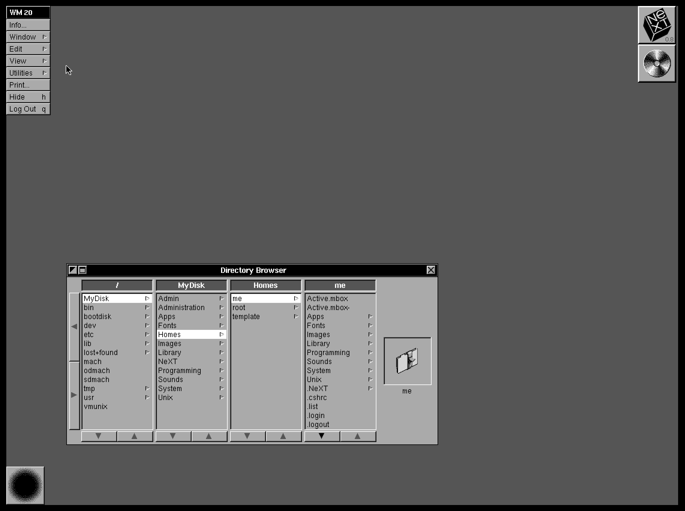
1.
Column view as a concept and when done well deserves to be in the UI hall of fame. It flew and still can fly high in the Finder, and it was the unsung hero of both the iPod and the iPhone. It’s really fun to fire up NeXTSTEP 0.8 in Infinite Mac and see its first incarnation.
2.
Apple decided not to ship the auto-sizing columns a few years ago, hiding it under a “defaults write” incantation as a sort of a beta, but then seemingly just launched it this year without any changes. There are some charitable explanations – perhaps the beta was hard crashing Finder and the released one no longer does? – but in the current zeitgeist I’m feeling that it’s something more like this: the people with taste who were stopping it from getting launched in the bad state were either sidelined or are no longer there.
3.
And it is a bad state. It’s a first draft made public. Like anyone who deals with layouts learns over time, things like this one need careful min and max widths to have certain good pleasing and stable visual rhythm. They might even need a scale or a grid on top. And the fact that the width accommodates only visible objects doesn’t seem to make sense.The top hand doesn’t know what the bottom hand is doing, and it feels the feature is incompatible with itself.
This feels like an old Unix windowing feature, a sketch of an idea for GUI nerds who get excited about just the cool concept alone, ignoring the execution. Although, to be fair – this is opt-in and buried as the last checkbox inside a pretty obscure window. This might still be GUI nerd territory.
4.
So Apple really did think we’re going to love Liquid Glass, huh?
83% of participants associated the floppy disk icon with saving. […] Another 13% described this object literally with responses such as “disk,” “disc,” or “this is an SD card for storing information.” These responses were not coded as “save,” but still suggest familiarity with the image.
What a fascinating journey! The icon didn’t change at all, but its perception went from being a literal representation of a familiar object, to a skeuomorph once floppies were replaced by hard drives, to then a symbolic representation of physical media in general (a lot of people think it’s an SD card – or perhaps even that floppy disks and SD cards are one and the same), to increasingly just an abstract symbol that represents saving as a concept, registering similarly to the circular arrows for syncing, and an arrow pointing south for downloading.
NN/Group is itself kind of a floppy disk, trying to walk a fine line between their legacy and reinventing themselves. They’re dismissed by many as old-school, academic, boring enterprise software aficionados, relics of a different era. I see some of that and often disagree with them, but I also sometimes appreciate their rigor, reliance on user studies, and outright dismissal of fashion in UI design. I want to revisit their site in more detail and see how I feel about it today, 30 years after Jakob Nielsen’s books rocked my world.
Everybody who routinely takes screenshots on a Mac knows very well the motor memory heaven and hell that are the screenshotting shortcuts: ⌘⇧3 to grab the whole screen, ⌘⇧4 to grab part of it, hold ⌃ ahead of time to put the result in the clipboard, press space at the right moment to select a window, hold ⌥ at a different time to remove a shadow, and so on. (Yes, there’s more.)
It’s strange to talk about those shortcuts, because the world is divided into two groups: people who have never used any of these because they are the scariest shortcuts that induce RSI if you just think about them, and people who have used them for so long that their fingers do all the work. Either group would struggle with writing the above paragraph – as did I, needing to watch my hands first, and then take notes.
But: why do the shortcuts start with 3? After all, ⌘⇧1 and ⌘⇧2 don’t seem to do anything.
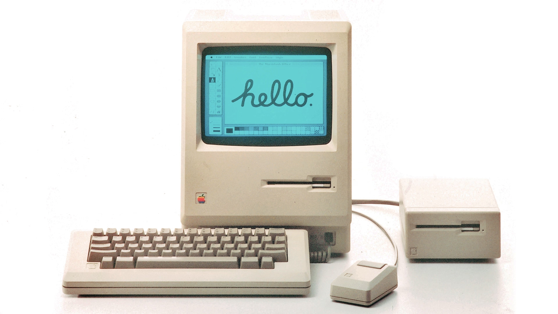
That wasn’t always the case. Turns out that once upon a time Apple was trying to create a larger universe of nerdy shortcuts for your Mac. The effort is so old – they were introduced in 1986 – that ⌘⇧1 was added as a quick shortcut to… eject the floppy disk. And, since you could also have an external floppy drive, ⌘⇧2 was assigned to eject that, and the shortcuts for screenshots followed in sequence: ⌘⇧3 to save the screen, and ⌘⇧4 to send it straight to your printer. (Even then, there was already Caps Lock thrown into the mix, too, switching between the entire screen and the current window.)
Early BASIC programmers knew to separate their line numbers by 10 because there will always be a line you want to insert in between, but keyboard shortcut designers do not have that luxury.
And so the nice system backfired immediately. Some Macs started coming with two built-in floppy drives, but still allowed you to plug in an external one. What would you press to eject that?
Well, of course it had to be ⌘⇧0, since ⌘⇧3 was already taken.
(In an absolutely delicious bit of rhyming, the 0 key itself is on the “wrong” side of most keyboards – except Hungarian – because it was added to keyboards before the 1 key was! It felt more natural to put it after 9 than right before 2.)
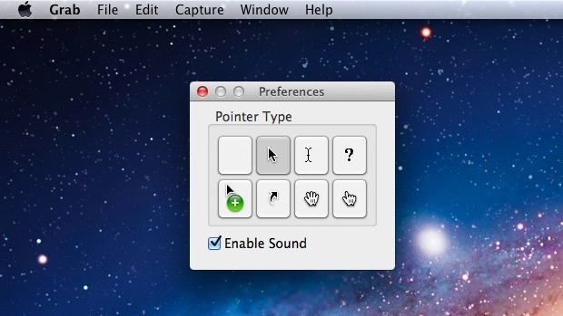
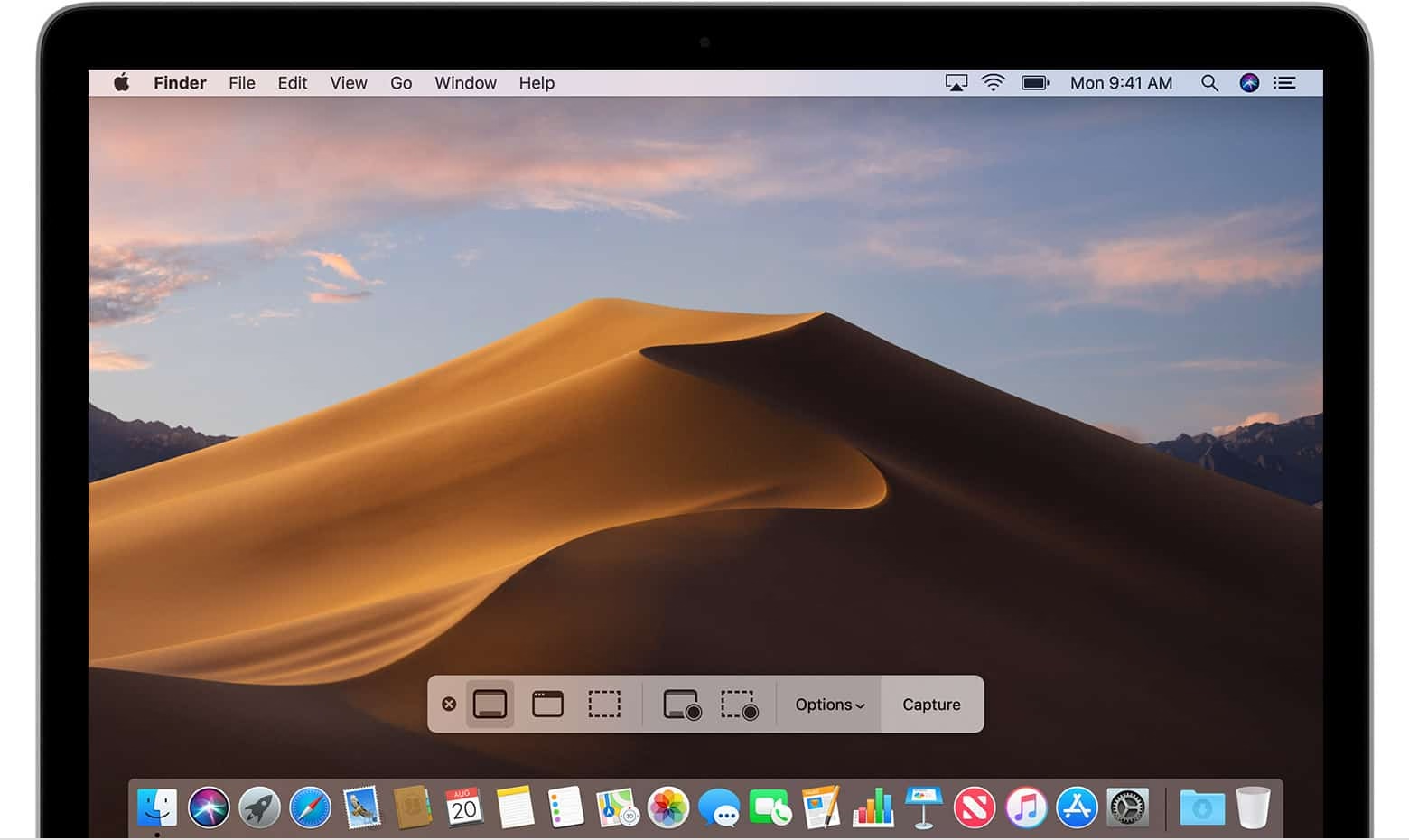
Things were quiet for a while. Floppies disappeared over time. Only in 2018, Apple evolved the old Grab app that it inherited from NeXT into a Screenshot app, and assigned it a new shortcut, ⌘⇧5. That was a nice improvement – video recording, a very helpful timer, a few smaller options, and a bit of a GUI thrown atop for convenience.
There are a bunch of system and change management lessons in here, but I want to talk about something else I just learned about.
Acorn 8, a graphic app, has a delightful screenshotting feature parked under ⌘⇧7 that does something incredible: it takes a screenshot, but does so in a way where windows are separate layers, grouped by app. It’s amazing; you can re-compose stuff afterwards, reveal covered stuff, remove windows, even change the wallpaper. A mouse cursor arrives too in its own tiny layer, like a cherry on top.
I’m sharing this both because I gather people who read this blog take a lot of screenshots – but also because this is software craft. I know “delightful” is (mis—? ab—?)used to refer to beautiful but slow transitions, and cute but distracting UI copy, but this is the stuff of true delight: using newly abundant technology to actually do something useful, and rewrite the rules of something that hasn’t been touched for ages, in a way that feels magical. There is still room for improvement – notably, you cannot just fire and forget a screenshot straight into your filesystem – but I find this kind of stuff inspiring.
I also know what you’re thinking: hey, what happened to ⌘⇧6? I’m not going to tell you. It’s probably not that hard to google it, but maybe you’ll enjoy trying to guess like I did. What was a feature of Macs that arrived after 2018 that Apple would want you to forget about even more so than the floppy disks?
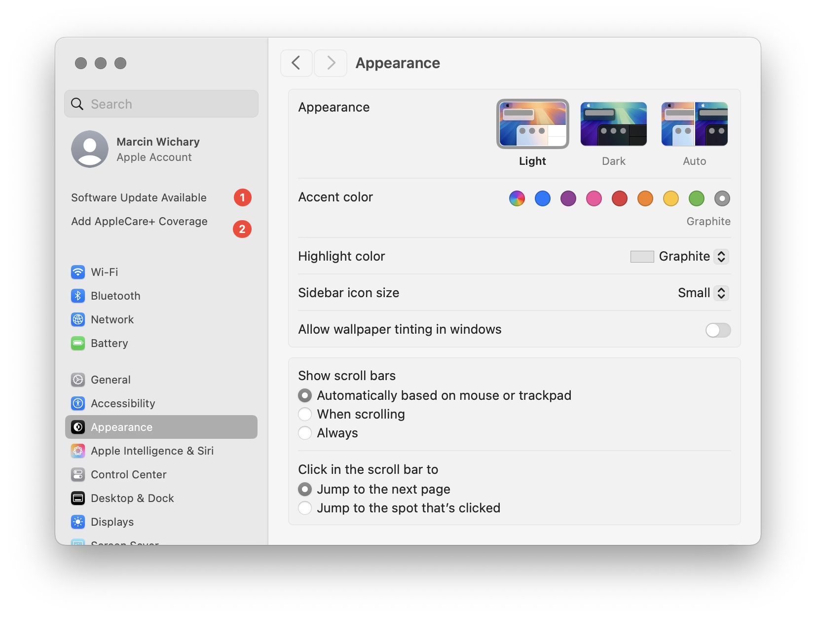
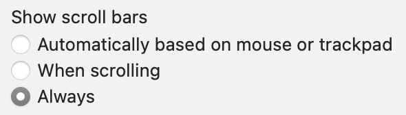
Many designers and engineers have Apple products with their flawless and praise-worthy trackpads. By default on macOS, trackpad means only “shy” (iPhone-like) scrollbars are shown. Shy scrollbars become half-visible when two-finger scrolling, and only fully visible when hovering over them.
To anyone working on front-end, I encourage you to toggle this setting to “Always,” and convince half of your team to do the same. Your macOS will now pretend you have a mouse connected, and show more traditional scrollbars, all the time.
Why? Because you might already be accidentally generating spurious scrollbars without realizing. Here’s something I just spotted in Coda today:
This scrollbar serves no purpose, so it will become visual noise for a lot of your users. But when you yourself use “shy” scrollbars, you might not even realize.
Of course, the scrollbar is just a symptom of a bigger problem – an accidentally scrolling surface that will be janky to everyone regardless of their scrollbar visibility status.
Always-visible scrollbars make it easier to spot these, not to mention also being helpful in spotting:
scrollbars mismatched in theme (e.g. light scrollbars on dark-theme surfaces) or accidentally left unstyled
scrollbars not fully nestled into their correct edge, accidentally being offset from the top or the right
using a wrong CSS setting for overflow (or not knowing about the -x and -y variants), and consequently showing both scrollbars when one will suffice
the loading state or skeletons not anticipating a scrollbar appearing later
that most frustrating occasional math/measurement issue where the appearance of vertical scrollbar reduces the horizontal space, and as a result also makes a horizontal scrollbar appear (see also: scrollbar-gutter)
An entertaining 9-minute video by Shloop that starts with a common mistake of typing in an English mode on a Korean keyboard, but then goes through a bunch of other fun and light input internationalization stories:
This first one – in response to pressing the volume buttons – feels world-class. Subtle responses to buttons being pressed, nice haptics, good physics:
This one – stretching of the control center – made me incredulous. The performance and physics of it all are good and fluid, but this feels like absolutely the wrong thing to do here. I think it’s as designed, but it feels buggy to me. Maybe I’m oversensitive to stretching type and shapes like this, but I can’t stand how icky it feels. I am not sure I have seen another place in iOS 26 where elements would stretch in such a cheap way:
And this one – tapping on the album cover to make it show and hide – is bad in perhaps every possible way. It feels designed poorly and engineered poorly, like an HTML approximation of a real thing. All sorts of bad curves and sudden switches, slight reorientations of UI, even some flickering of interface elements at the bottom. It feels so rough I would probably just do a hard switch, no transition, until I got this right. After all, no animation is better than bad animation, and this is not responding to fingers in real time (when the user controls the “speed,” and you absolutely need a transition):
Ultimately I don’t know if this is “as designed,” or rushed, or what are the causes. But It’s interesting and a bit hard to realize that these days even animations in iOS 26 – once, I believe, a staple of good design and execution – are all over the place.
This is a really funny story happening in the online universe of Final Fantasy 11:
Once killed, a notorious monster shouldn’t respawn until after the next monthly tally, but lately defeated notorious monsters in Limbus have been reappearing early. That’s because, Square Enix said, “the server-side data recording the defeat status of notorious monsters is unexpectedly being cleared.”
Thus, there’s only one way to guarantee no players are robbed of hard-earned Limbus loot: Square Enix is dispatching Game Masters to personally murder every notorious monster in Limbus so the FF11 servers can properly verify that they’re really, truly dead.
“To achieve this, Game Masters will visit each World in sequence and defeat each motorious monster individually,” Square Enix said. “We apologize for the inconvenience.”
I know this is not a bug fix per se, but it’s interesting to be doing some bug cleanup from the inside.
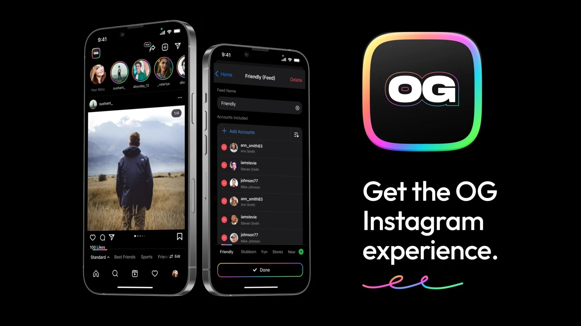
I recently learned of the OG App from 2022, which offered an ad-free, simpler experience to users frustrated with Instagram changes.
The app didn’t last – it couldn’t last – but it was a fascinating statement.
In a different corner of the internet, Michael Leggett, one of the former Gmail designers, created Simplify – an alternative “shell” to Gmail:
Hundreds of improvements (small and large) to streamline, simplify, and enhance Gmail’s design and functionality. Hide the features you don’t use, customize the ones you do including setting the list and message width and fonts.
Bad design can occur for a number of reasons including but not limited to:
Our needs as users are not well understood, prioritized, or aligned with the company’s goals.
Entropy: The natural decline of products over time as the vision decays or blurs and new features are conceived without consideration of the whole and added faster than the system’s overall design and architecture can evolve to support them.
Good design is hard. Good design is more than making a product pretty. It is about having the right capabilities in an intuitive, respectful, and well-crafted offering. I hope to expand on this topic in future posts.
I know ad blockers and “reader modes” exist, but these alternative shells go much further and change the original app’s design. I wonder what other examples of that are out there.
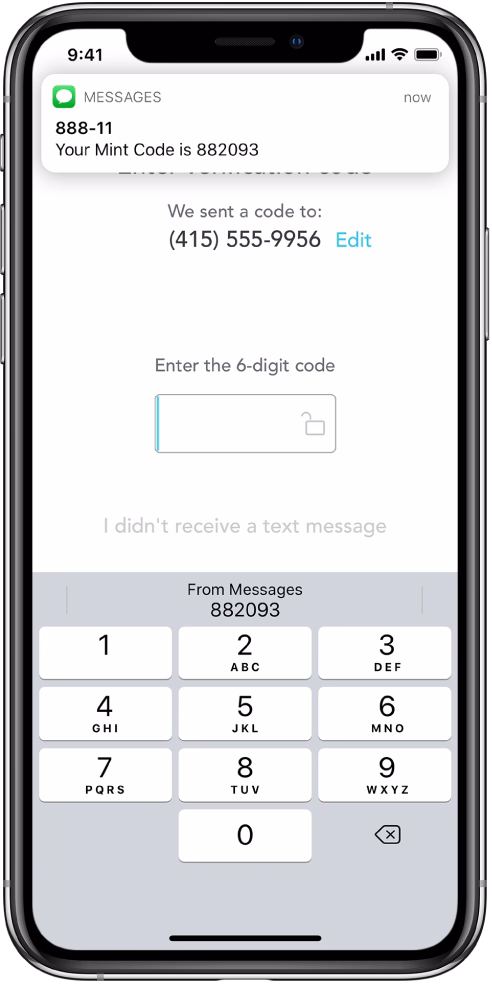
After James Moylan’s death in December, we were reminded again of the Moylan Arrow, the little arrow telling you which side of your car has the little fuel door:
I started wondering: what would be the conceptual equivalent of this in software? My best guess would be iOS offering to fill the one-time code from a recent SMS:
This is what it has in common with the Moylan Arrow:
everyone benefits from it
it happens all the time
it solves an actual little (but not too little) frustration
it’s there at the right place at the right time
it is relatively low-tech (it’s not an overdesigned or an overengineered solution)
once you know it’s there, you will love it forever
Curtosis on Mastodon unearthed the original 2019 Twitter thread from one the creator of the iOS feature, Ricky Mondello (link to XCancel), which I‘m reproducing here:
The idea for Security Code AutoFill came out of a small group of software engineers working on what we thought was a much more ambitious project. It wasn’t a PM, it wasn’t just one person, and it wasn’t what we set out to do initially.
It started as a small side idea we had while designing something very different. We jotted it down, tabled it for weeks, and then picked it up after the “more ambitious” project wasn’t panning out. It was hard, but I’m so glad we changed focus.
Even with a gem of an idea, it was still just an idea. Ideas are obviously super important — they’re necessary, but not sufficient. Here, the end result came from the idea, teamwork, and execution.
Years later, I’m still so proud of the team for making this feature happen. The team combined expertise from several areas to ship magic that worked on day 1, while asking nothing of app and website developers, without giving anyone your text messages. This still inspires me!
To every one of the folks who made this happen, I’m still in awe. Y’all are the best. <3
Addendum: FAQs
- “SMS is bad.”
↪ I know.
- “MITM.”
↪ I know.
- “FIDO is better.”
↪ It’s complicated, but acknowledged; I totally get it.
- “Android did it first.”
↪ Nah. Details matter. Privacy matters. And clipboard != AutoFill.
- *negativity*
↪ Not now. :)
I asked others on social and here are some other contenders I liked:
The indicator that alerts you of Caps Lock when typing passwords
I read Mike Monteiro’s book of pre-pandemic essays called The collected angers. The book has less to do with the subject of this blog, but I grabbed a few quotes that resonated with me and seemed relevant.
In order not to make it too reductive, I’m also linking to the original essays for those who want to follow up:
The worst feedback you can get from a client is “Wow. It looks like you worked really hard on this!” Stop using your work like a time card. If you did it right, it looks like it was effortless. It looks like it’s always existed. And the client will probably be irritated that they paid you for 30 hours of work to do something that looks like it took an hour. Which it did. They’re just not seeing the 29 hours of bad design that got you to that one hour of good design. And for the love of god, please don’t show them those 29 hours of bad design. A presentation is a shitty place for a sausage-making demonstration, and you’ll just come across as a defensive, unsure person needing validation.
Learn how to steal. Be aware of your history. Design is the oldest profession in the world. You’re not the first person to tackle whatever design problem you’re tackling. See how others tackled it. Take the best solutions you find and improve on them. Don’t burn time solving things from scratch. Make use of what others have learned.
I liked the angry website Bugs Apple Loves because it’s hitting on something that got me worried in recent months: Apple has been bad at bugs for a while now, but we might be overfocusing on giving them crap solely for some of the most visible – even visual – Tahoe stuff.
This is a condensed list at the time of writing, as the site itself doesn’t make it easy to see it:
Mail search doesn’t work
Autocorrect won’t take no for an answer
Apple Pay: card icon changes address
Google Contacts sync is a black hole
AirDrop: Looking for devices...
iCloud Photos: ‘Uploading X Items’
Spotlight: ‘Indexing...’
Personal hotspot won’t auto-connect
Apple Watch widgets won’t let go
iOS text selection is pure chaos
AirDrop shuffles targets mid-tap
macOS 26 window resizing doesn’t work
There are themes here: “the interface doesn’t remember my preference,” and “things move around as I interact with them,” and “some process gets clogged up,” and “a thing gets stuck and doesn’t respond to interface actions.”
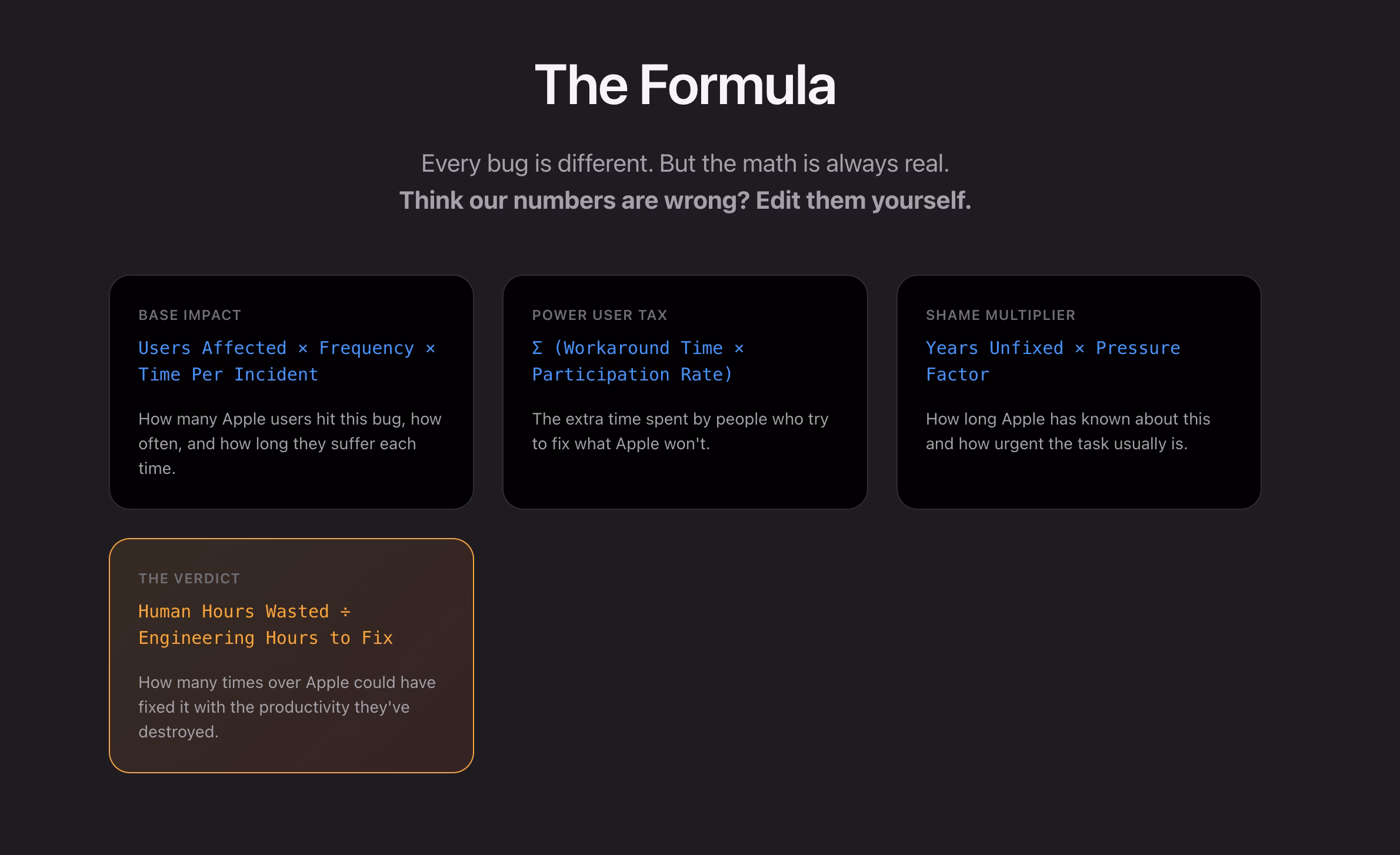
What I appreciate about this is that none of this is very “visible” stuff, but the insidious things that add up and bother on the daily basis, chipping away at your flow first and sanity second – which the site tries to quantify via a formula:
I think this is really interesting, even as a satire.
I found it’s really hard, if not impossible, to justify design or experience bugs using the same frameworks as other engineering bugs. As Mike Swanson wrote: “You cannot easily measure the resentment. Or the rage clicks when they smash a button to dismiss another […] pop-up.”
A lot of it is utterly subjective. Various small frustrations add up in non-linear ways. A lot of it doesn’t subscribe to binary “data loss or not” or “does it function or not” classifications. A lot of it feels heavy to fix in terms of context switching, so it’s timeboxed and then discarded when the time box overflows.
I have seen engineers say “Oh, it’s a long-standing bug, it’s been like this for 3 months” as a justification to deprioritize something, while to me it feels like that should be an accelerant. The users have already been suffering for 3 months!
So maybe metrics like these could actually help? Quantifying at least the blastradius (affected users + usage per day) seems valuable, not to mention the embarrassment of seeing something like “9.1 years unfixed by Apple.” (And yes, internal embarrassment and shame should also be a metric.)
This would be harder to do for creators of the site, but easier inside Apple: I would also try to quantify vocal user frustration. One of my tricks when thinking about bugs has been “Notice when your users are really angry about invisible stuff.”
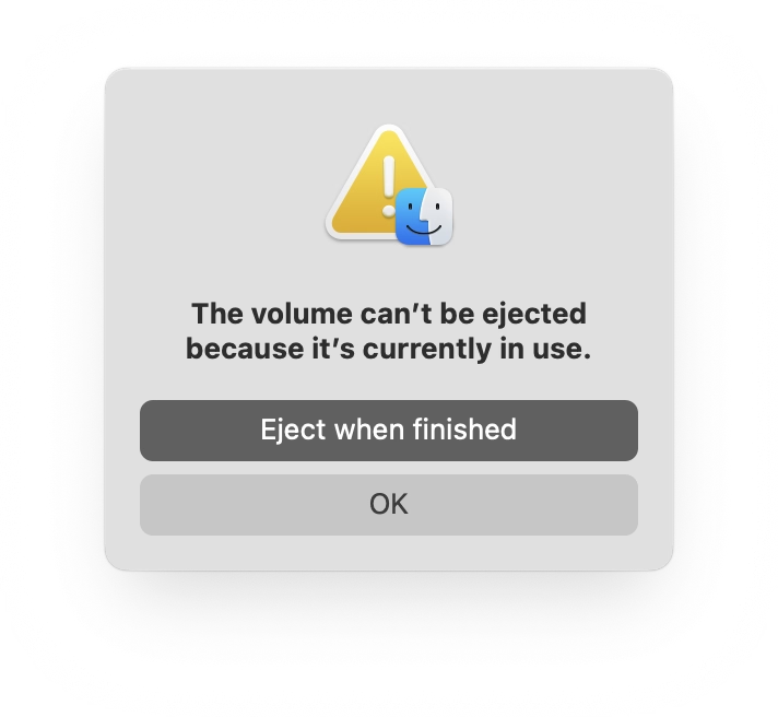
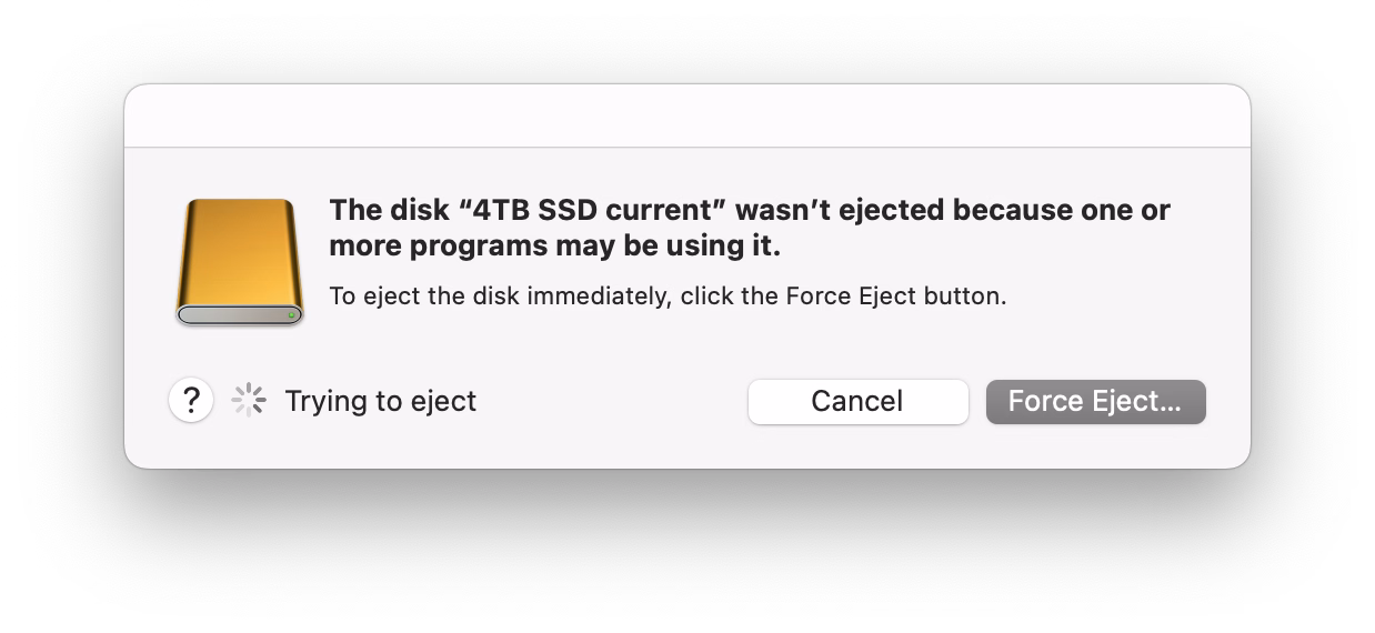
If you plug in a CD drive (he said with a straight face in the lord’s year 2026), and then eject too soon, the system offers this dialog, which allows you to say: Eject whenever you’re done with whatever you have to do.
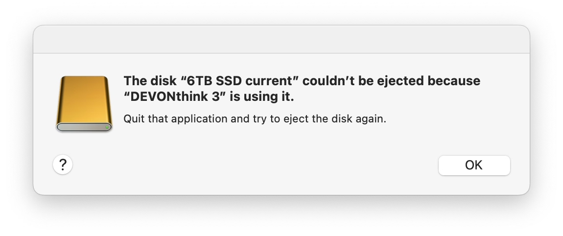
But more modern media, like SSD drives, don’t show that window. The best case scenario is that you get a dialog box like the 1990s never ended:
It gets worse. Often, you get zero help in identifying what the “programs” actually are. (The word on the street is that it might be stuff like Spotlight indexing, which you can’t really control.)
More often than not I just click Force Eject or jank the drive cable out, which feels really unpleasant. I would guess many people do the same.
So at this point we are two steps worse than the original CD experience, which… wasn’t even that great! A pretty clear improvement on this already exists elsewhere in macOS, and could be reused here – “hey, you don’t have to do anything, just give me a second while I finish up here.”
(Can’t help but notice the discrepancy of visual styles of these windows, and even the inconsistency between calling things “applications” vs. “programs.”)
One of the most potent themes in Stanisław Lem’s writing was the fallacy of first contact.
Lem argued that we are just not ready for an actual meeting with something truly alien. That the most open-minded of us are close-minded on a cosmic scale. That sci-fi made us think that aliens will look like human with prosthetics when good, and insect-like creatures when evil, but sci-fi needs to be self-constrained for all the same reasons; showing us something actually inhuman will immediately render it utterly incomprehensible.
He wrote about it in Eden, and Solaris, and The Invincible, and Fiasco. The last of these is a book I was once so angry at that I threw it at the wall.
It also happens to be my most favourite book, ever.
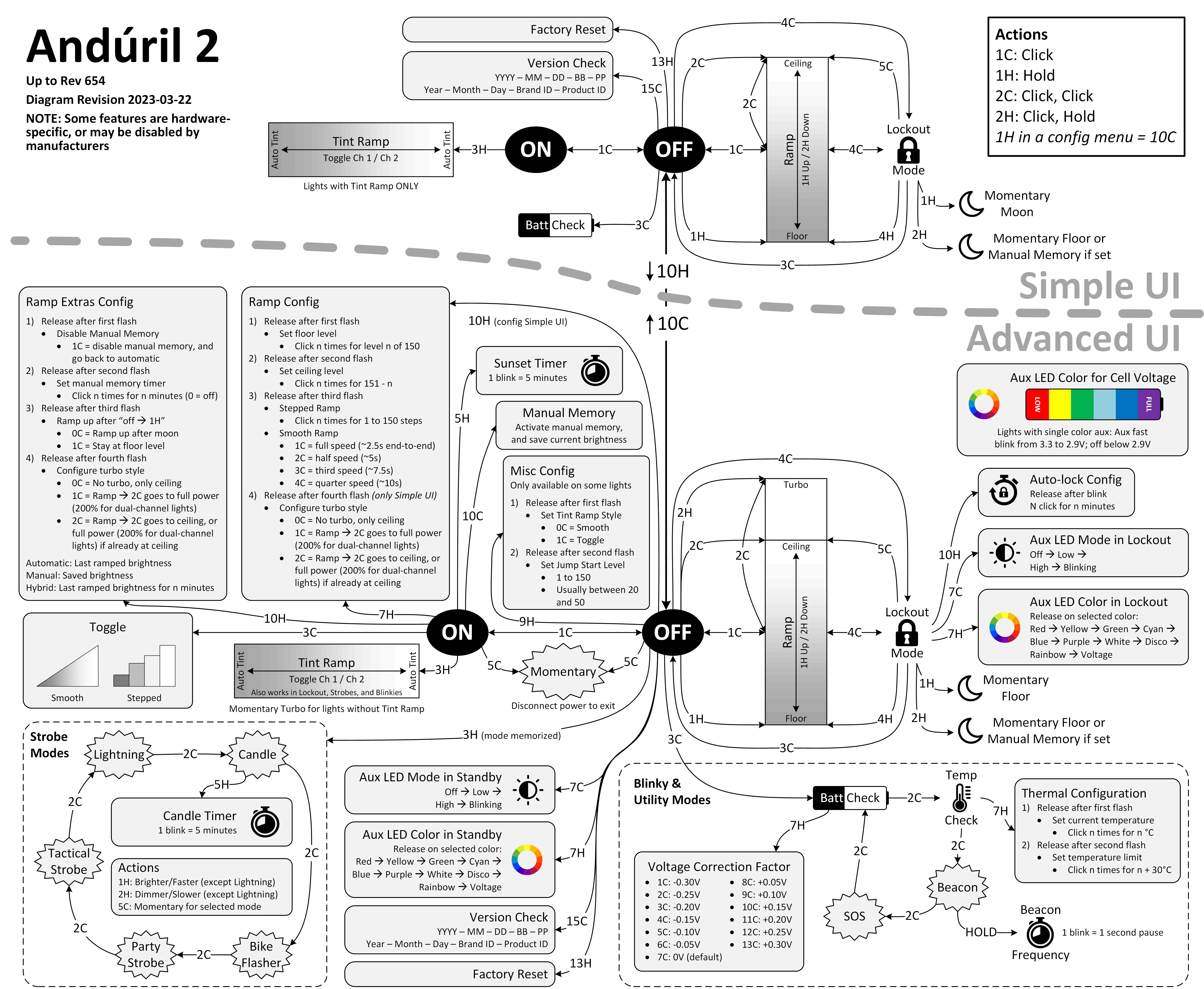
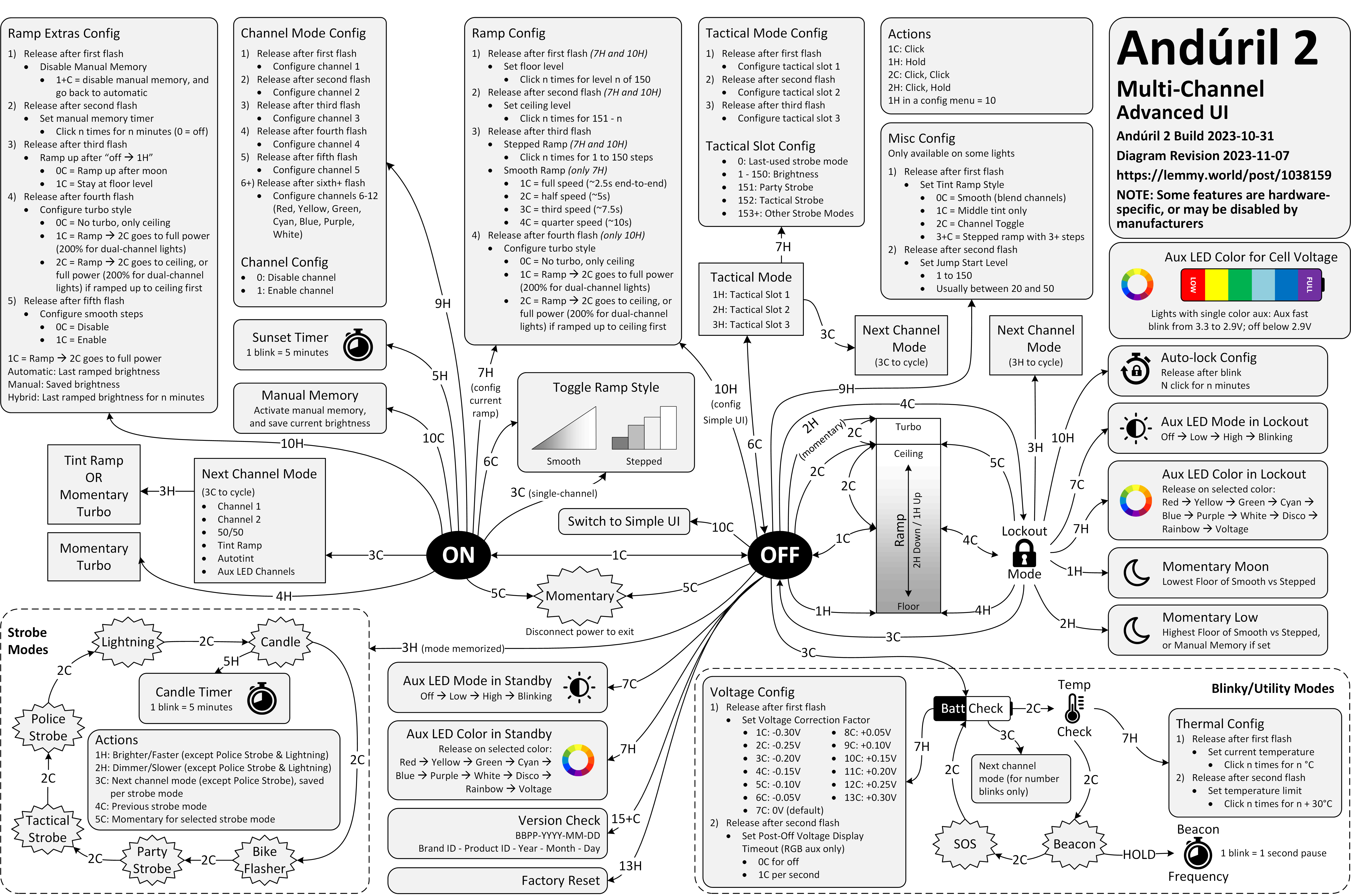
Anyway. This is a diagram for a single-button flashlight called Andúril 2 (larger version):
I saw it for the first time earlier this week. I was speechless. Maybe a little bit in awe. I know I’m supposed to hate this, but this feels so profoundly… alien, that I don’t know if anything I know applies here. I don’t want to judge it by the wrong set of rules. I want to understand the dividing lines between the UI and its explanation. I want to study it more.
Oh, and because I was curious too – this is the flashlight:
This is of course competence porn, made even better by the dry Polish lektor-like delivery. But it’s also a puzzle. I watched this so many times. There are so many great UI lessons in here:
You can absolutely put graphics inside a textbox
Sparklines rule
Slider is still the best UI element in history
Previews don’t have to feel like training wheels
Synchronizing sounds to visuals is so powerful (see: turn signals on a car dashboard)
I found myself thinking about how you’d design something that feels real-time, but also needs to be resilient against typos, and has a distinct “commit” moment (which is what I think those yellow flashes are); some of the best moments in the video are the quick fixes that aren’t narrated.
Ultimately, this also shows how powerful and underrated plain text can be as interface. It’s a bit like designing straight in CSS, operating at the weird intersection of motor memory, creativity, and abstraction. (Is there a CSS editor that feels more like this?)
On top of all of this, the act of building the track this way is also how the finished track would sound like. Amazing stuff.
Remember all these jokes that went like this?
[God looking at a pug dog for the first time] What the hell did you humans do with my bad ass wolf I gave you?
Imagine sitting the creators of the typewriter in front of YouTube and having them watch this video.
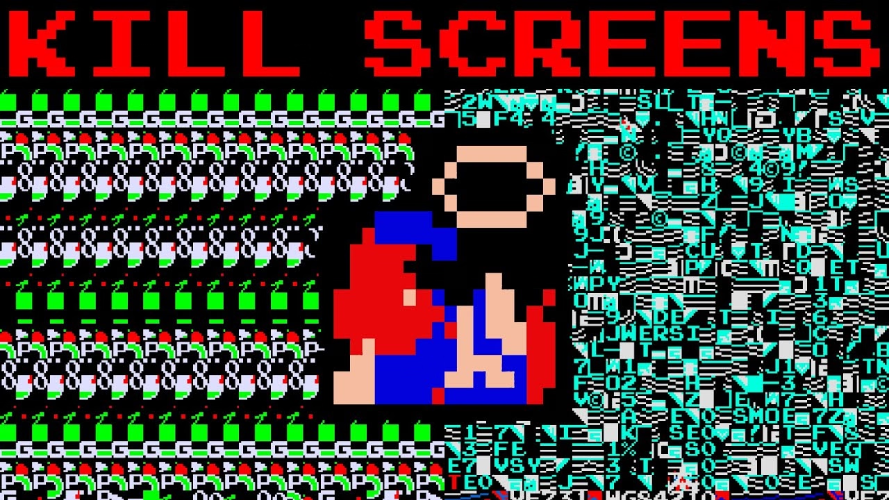
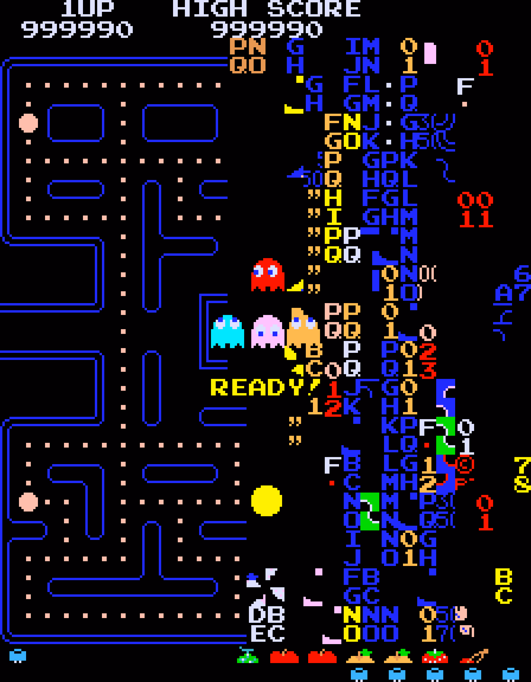
I’d guess a lot of people know that the original 1980 Pac-Man ends accidentally with an iconic, glitchy, and impassable “kill screen.” Many people will also nod with recognition at hearing the kill screen is level 256, a number that immediately gives some ideas on what might have happened.
But this fun 11-minute video from 2017 by Retro Game Mechanics Explained doesn’t stop there. It shows, step by step, exactly what is going on when you reach level 256, and how each one of the glitchy things appear on the screen.
It’s a little mesmerizing, like watching a building demolition in slow motion.
Ross designed Input, a coding font superfamily which was very inspiring to me in the day, and taught me that coding fonts could be a place of surprising creativity and innovation.
First of all, Input has four width options: from regular through Narrow to Condensed to Compressed – this not only allows to avoid the “blocky/squareish” nature of many coding fonts, but also, pragmatically, to squeeze in more stuff on mobile screens.
Secondly, since a lot of coding environments didn’t (and maybe still don’t) allow for fine-tuned typography settings, you can bake them into a font upon download – choose a different default line height to be there in the font itself, or have your favorite style of zero just hanging there in the default slot.
Thirdly, serif versions of Input coexist with sans serif, and so does italic, and you can mix them together.
But most important thing comes at the end: you can imagine coding in non-monospaced fonts! What seemed like blasphemy before made so much sense once I put it to use – I still code in Input Sans Narrow (non monospaced) to this day:
Of course, since the release of Input in 2014 a few other coding fonts did interesting creative things in this (mono)space. But to me this will always be the original that opened my eyes to what’s possible, and the talk captures so well a lot of deep thinking that went into the font. To quote Ross:
Type design is design and design is about solving problems.


