Fun interface on my bike
This still remains one of my favourite pieces of UI ever designed. I know this is is not software, but this to me is exactly the right kind of “delight” in this context.
(Apologies for a shoddy video.)
This still remains one of my favourite pieces of UI ever designed. I know this is is not software, but this to me is exactly the right kind of “delight” in this context.
(Apologies for a shoddy video.)
A really fun 2021 story by Fabien Sanglard at the perfect-for-me intersection of bugs and typography.
In 1991, just days before the final deadlines, Akira Nishitani, one of the graphic designers of the absolutely seminal arcade game Street Fighter II realized they misspelled the world “Warrior” as “Warrier.”
The typo was there for months and no one noticed. But the moment it was noticed, the graphic ROMs were already burned and impossible to change, and the code was due in three days.
What would you do? I’ll let you click through to read, but I really enjoyed this short story.
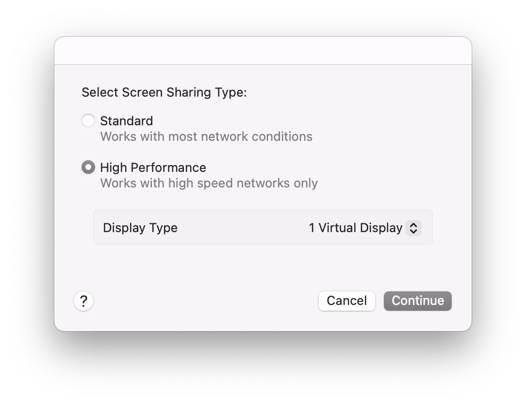
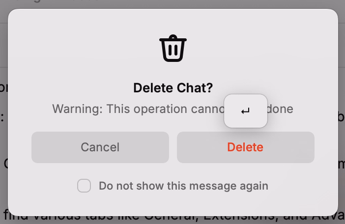
One of the frustrating patterns for me is a dialog box that doesn’t offer “skip it next time” option, or even just defaults to remembering.
My go-to examples? Apple’s Remote Desktop which always throws this thing up on connection:
And this in Photoshop upon saving a PNG file, which has been there forever:
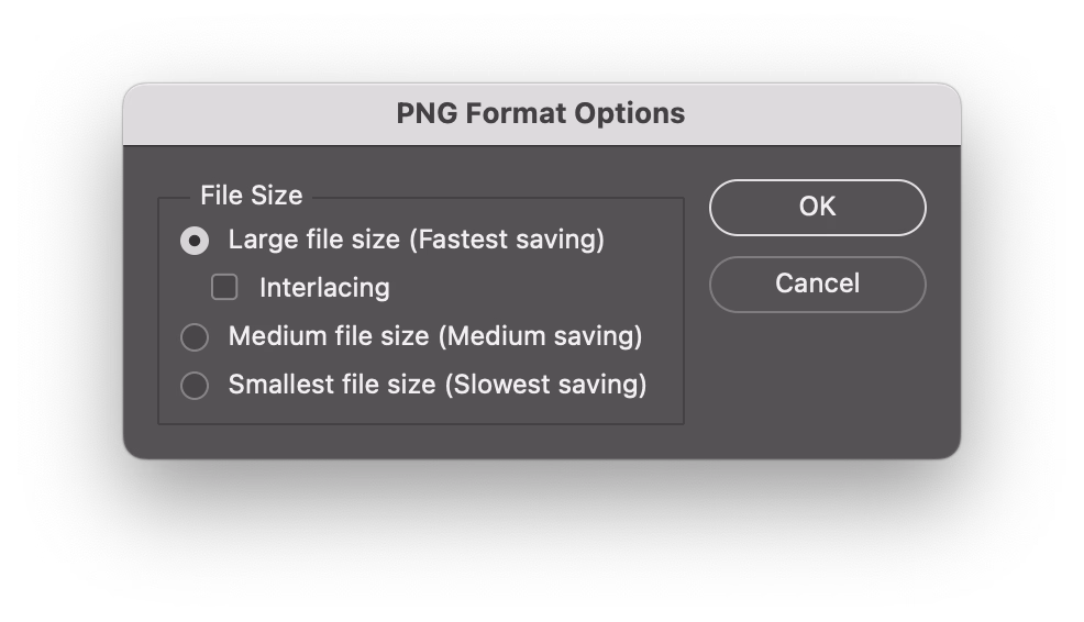
I never change these options. These are flow-killers; trees have grown to maturity as I have spent collective hours in those dialogs over the years/decades, even though they serve no purpose for me.
(The worst part might be if you forget this dialog waits, and move on to do other things, and the operation you thought was completed never actually finishes.)
★★★☆☆
I was delighted by the Laws of UX website when it came out. The site was beautiful (it still is!) and it felt important to bring some of this stuff to designers earlier in their careers.
But the book based on the website was largely a disappointment, and seems like a good case study of an unsuccessful adaptation – it felt this was pushed to become a book without editorial help and without thinking too much about what makes for a good book.
The book lost a lot of what made the site great – it’s a pretty generic-looking production with flawed typesetting, an uninspired cover, and poorly sized and reproduced images. But chiefly, I also feel the book showed there is limited rigor behind the whole premise; the writing feels academic in the sense that it’s a little boring, but academic writing at least can be precise and follow process. Not here. The laws of UX are not “laws” in the traditional sense and the combination of “laws” presented, as well as examples of them in use, feel really arbitrary and sometimes at odds with the entire premise.
I felt disagreeing with the book often. For example, I feel the chapter about Doherty Threshold feels is teaching the wrong lessons (100ms is not enough for a bunch of things!). Or the advice on gradually deploying changes (Jakob’s Law) is missing a core component of maintenance and how to approach the contingent of users who will never graduate to the new interface if given a chance to stick with the old one.
I also started worrying that the book doesn’t fully understand how design works. From the very first page:
This project was somewhat unique in one specific way: I was being asked to justify a number of design decisions to project stakeholders, without any data to support them. Normally, when you have quantitative or qualitative data available to draw upon, this is pretty straightforward task – but in this case the data wasn’t available, so the process of justifying the decisions would have to be a little different.
This is… This is not what design is. This is never true. You rarely have the data – and if there’s data, it’s never netural, always at the mercy of people collecting it and people interpreting it.
My friend summarized it well – “design is not mathematical” – but at various moments the book suggests it’s as simple as knowing a certain “law” and applying it. This is perhaps most visible in the Aesthetic-Usability Effect chapter, which touches upon craft without really understanding it.
On the positive side: I think what the book is trying to do feels important and appreciated. Some of the stuff like Fitts’s Law or Doherty Threshold and Jakob’s Law are good to know about, they are still relevant, and can serve as useful tools in your toolkit as a designer.
I also learned some new things from it! I have never heard of shape coding before (turns out I’ve been practicing it without knowing, so learning about it was validating), and never really thought about the equivalent of heat maps for mobile.
Also: I don’t think this book is for me. I get a sense this is a volume for a very different group of UX designers, maybe even people at companies where UX design is not at all established as practice. There is a lot of stuff like explaining personas and basics of user testing and even ethics that feels somewhat out of place and like it’s padding the content – but I can see how that could be valuable. However, I still wish the book didn’t oversimplify a lot of things like I think it does. I believe there’s a way to do it while still keeping it accessible and not overwhelming.
But today, I would rather recommend the beautiful poster that seems more true to what the website was trying to aim for.
In terms of how I would improve the book:

When you accidentally rename a file to a name that already exists, Finder tells you about it, and then just dumps you out of rename, so you have to enter rename mode again and type the desired name.
This feels like such a 1990s way of doing things: throwing a dialog box and washing your hands away from the responsibility to make things smoother and more fluid.
It’s not hard to imagine a better solution that returns you to rename mode and keeps the name you entered so you can refine it, or even something that eschews the dialog box altogether, and does something simpler like a password shake or a little callout.
Reported to Apple as FB21509667.
I hate most font reveals; they’re written in a pretentious, corporate-meets-Design-with-capital-D way that’s devoid of any value or meaning or feeling, with the requisite highly polished motion graphics that feel pretty like empty sugar calories. They did feel like written by AI before that became a meme.
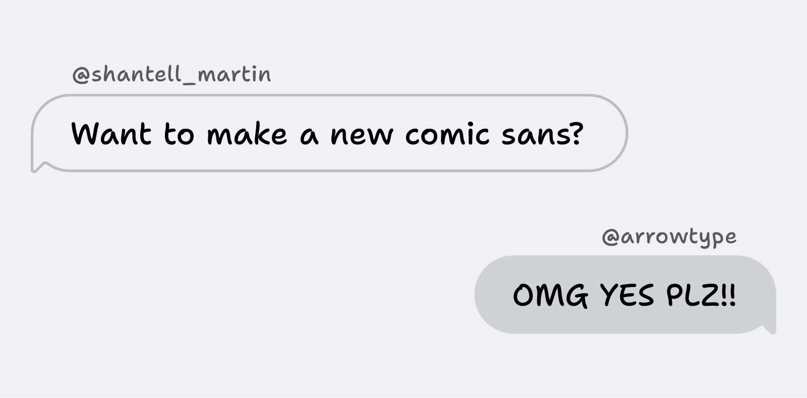
This feels like the opposite: an actual personal font announcement of Shantell Sans that made me feel things. From Shantell Martin:
When I was 20 or 21, I found out that I was dyslexic. When I started my art degree at Central Saint Martins in London, I was in an environment where it felt like the majority of people were dyslexic. I was instantly part of a cool group of creative people. However, I was disappointed about the amount of teachers who had never spotted my reading challenges. Instead of supporting me to learn to read and write, they punished me.
What I liked about this post is that it hands the mic off to other involved people: Stephen Nixon who “produced” the typeface, and Anya Danilova who took care of the Cyrillic side. It’s a simple technique, but I feel much more effective than doing the “oral history” a.k.a. “journalistic” approach of different people having various quotes interspersed. It can work, but only if you do it really well. Almost no one does it really well.
There’s just so much to love here. The motion graphics are actually useful, informative, and allow you to learn things! Even the “in use” photographs are delightful and don’t feel arbitrary.
Just well done all around.
(Also, I hate Comic Sans, so having something new in the same vein will be genuinely useful.)
I was just looking at some old 1980s screenshots and wondering “why don’t you ever see syntax highlighting in inverse video”? And then I randomly stumbled upon this deep dive into syntax highlighting from Nikita Prokopov.
I don’t know if I disagree with everything here, but there’s a lot of great stuff in there, and a lot of food for thought.
Highlighting everything is like assigning “top priority” to every task in Linear. It only works if most of the tasks have lesser priorities.
I thought the mention that comments should be visually promoted, not demoted, was particularly insightful.
Also, the idea that light themes are not popular because the colors are duller… this is very interesting. It could be so interesting to try a light theme with very prominent chiefly at the periphery of Display P3.
I have never been very invested in syntax highlighting because I find the UI to change it in text editors is usually pretty harrowing, but now I’m interested.
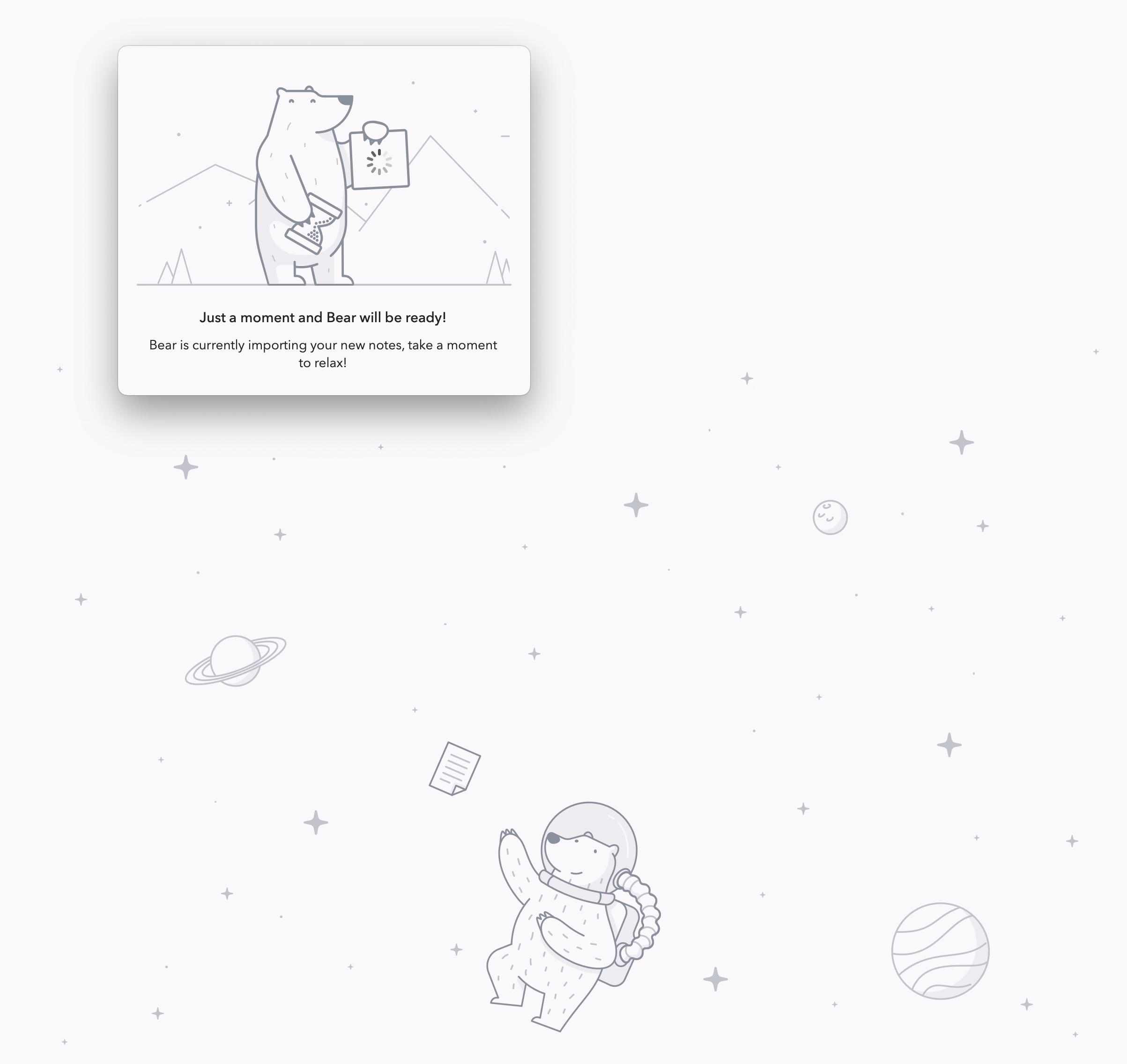
Bear – beautiful, whimsical, delightful, but dry on the details. This window was on the screen for many minutes:
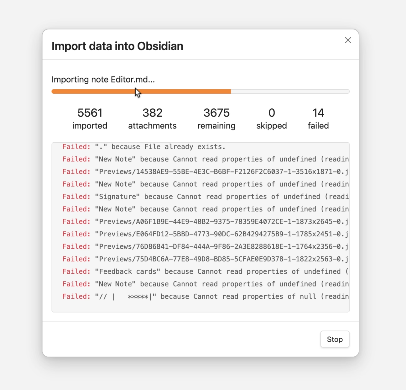
Obsidian (or, at least, the suggested Obsidian Apple Notes import plugin) – functional, informative, precise, but a bit on an uglier side:
As the meme goes, why not both?
A 2021 article by David Hall about shape coding:
Chapanis began interviewing pilots who had crashed B-17s and B-25s and a pattern emerged that turned his attention to the controls within the cockpit. As Fitts said ‘the intense effort to produce new weapons, the race against time in industrial production, and the magnitude of the program required to train men to operate these new machines resulted inevitably in many instances in which the final man-machine combination failed to function effectively.’
What Chapanis found when inspecting the cockpits of these planes were two identical toggle switches side by side, one for the landing gear, the other for the landing flaps. These controls were also similar in size and shape. […]
He modified the landing gear control by adding a wheel-shaped knob and a wedge like shape to the wing flap control. Now pilots could feel and easily map the shape to the intended purpose. […] Chapanis had solved a real life and death issue with one brilliant insight.
Chapanis was a contemporary of Fitts of Fitts’s Law fame.
I forgot this was called “shape coding,” or perhaps I never knew that? I have employed and sometimes pushed for a similar thing, but I called it making sure things have “distinct visual signature” or something like this. I think “shape coding” would be a more appropriate term.
The article shows one simple UX example – I would love to learn more about who’s employing this deliberately. It is, after all, the opposite force to consistency, and I’m always interested in negotiating with consistency.
A thoughtful look at macOS 26’s application of Liquid Glass by Howard Oakley:
I’m sure that, in the right place and time, transparency effects of Liquid Glass can be visually pleasing. Not only is this the wrong time and place, but those with visual impairment can no longer remove or even reduce these effects, as the Reduce Transparency control in Accessibility settings no longer reduces transparency in any useful way.
I have heard so many bad things about Liquid Glass specifically on Tahoe that I’m holding on and not updating at this time. Something tells me I might have to skip a version or two altogether, which feels unprecedented in the modern Apple times.
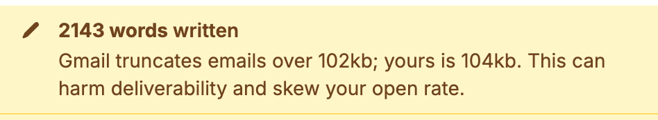
A thoughful moment in Buttondown. Gmail’s truncation has been going on for decades, and I have no idea why they still do this. Even the overflow interface for a truncated email is awful – the rest of it doesn’t appear in situ, but it opens a new window that where you have to start from the top.
So it’s nice that Buttodown warns you about it.
One thing I really admired in earlier versions of Windows was the thing that was also its weak point: the keyboard orientation.
I miss the old tradition in Windows where many commands had underlined letters, and you could simply press Alt and that letter to jump to it:
If I remember correctly, eventually this got simplified so that the underlines were only there when you held Alt (although I bet there was an option to keep showing it all the time).
Opening Windows 11 today, it feels like the system got less elegant. I can still press Alt and stuff happens, but it doesn’t look nearly as good or tightly integrated, and the two alternate entry points (Alt and the keyboard shortcuts) become muddled:
In the meantime, on a Mac, in various places apps reinvent the wheel by their own thing.
I just saw this in Nova, the code editor, which is very thoughtful; those shortcuts only exist within this dialog (and one wonders if they couldn’t just be letters without modifiers)?
A little more old-fashioned from Photoshop, and the same question: could they just not be digits, without requiring ⌥?
Previously, I mentioned yet another idea from DevonThink.
I appreciate these gestures toward moving faster via a keyboard, but I wonder if we lost something that already used to work well in old Windows.
In iOS, I like how cropping quietly snaps to things that look like borders, with gentle haptics, without announcing anything:
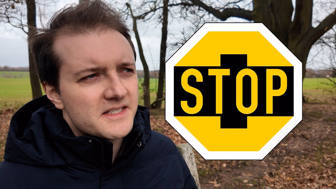
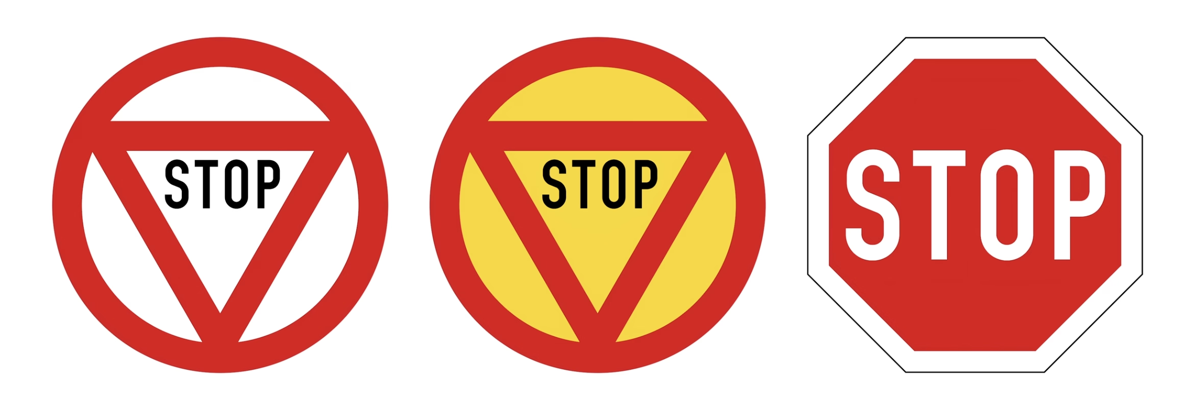
A funny 12-minute video by Chris Spargo about why traffic signs in the world are standardized only to some extent. This was interesting to me generally in the context of Europe being more iconographic, and America being more “word-y” in their sign design, which extends to devices, keyboards, and (presumably?) software.
The story why [the old STOP sign] got replaced by the American version is also the story why the rest of our signs still look different, and why they probably always will.
I am starting to collect all the problems I routinely find in Finder. I can think of ~15 off the top of my head; maybe this will turn into an essay of sorts. I hope this isn’t too boring for you.
Sometimes Finder takes a really long time to update the list of files after something changed it.
All my screenshots go to a specific folder. In these videos, you can see me taking screenshots with ⌘⇧4 while looking at the folder where they arrive.
The first one is fast – just as fast as it should be. The ones after that arrive with a few seconds of delay that feels completely random.
But this is nothing compared to this, just a few minutes later, where the delay was over 50 seconds. Nothing changed. The computer was not under load.
This happens routinely and feels completely random.
There is also, as far as I know, no way to force a re-sync with a keystroke or a button or a pull-down gesture, which could be at least a way to manually alleviate the symptom (if not the cause).
Hearing what others told me and based on prior experiences, I don’t have high hopes for any of this, but I want to be a good citizen. So I am filing bugs with Apple for all of these. I do not believe I can link to this directly, but the report I filed for this one is FB21444299.
I have recently been on a bit of a Japan kick, and someone on social sent me this 2018 article from Clyde Mandelin about translating Japanese videogames:
There’s a common assumption that when you translate something from English into another language, there shouldn’t be any English left when you’re done. Otherwise it would be an incomplete translation, right? And you’d feel like you got cheated out of the money you spent on translation, right?
If you’re translating into Japanese, then that assumption is wrong. English makes up a significant portion of the Japanese language today, and on top of that, English has been a major part of Japanese video games since the very beginning.
I have been thinking a lot about translation ever since in the 1990s, both Windows and Mac OS have been translated to Polish, and while Windows felt okay, people at Apple used more “proper,” but often strangely archaic words for the Mac OS translation that were absolutely readable, but made the Mac felt a bit… I don’t know… medieval? (I saved both of the translations and put them up online long ago. They are still online.)
It is so hard to explain unless someone knows both languages in question, but so important to understand all these little nuances to get it right.
In the world of typing, for example, right-to-left writing systems are not just “going the other way,” but also have to accomodate LTR snippets. Similarly, is perfectly fine in Japanese to see Western words – not just next to Japanese writing, but sometimes inside it. For those working on these, it must be annoying that you already have to do more work with more complex writing, encodings, and stuff (most languages to me feel more complicated than English) – but now you also have to include entry points for other writing systems.
The issues of translation are fascinating to me. Please send more if you see them.
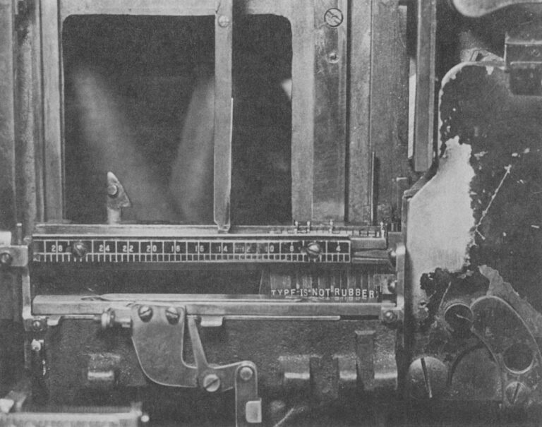
Oh, this is a fantastic adage I haven’t heard before, mentioned here in 1978, arguing against distorted, or “faux” typography:
A Linotype assembly elevator with the gate closed. This is the center of an operator’s attention as the mats tumble down and are arranged automatically in lines. The spacer bands adjust themselves to fill out the line but only so many letters can fit in any measure, proving the old trade adage that “type is not rubber.” Modern photocompositors have lenses that can distort the image of the letters to fit where they couldn’t. Today, type is rubber.
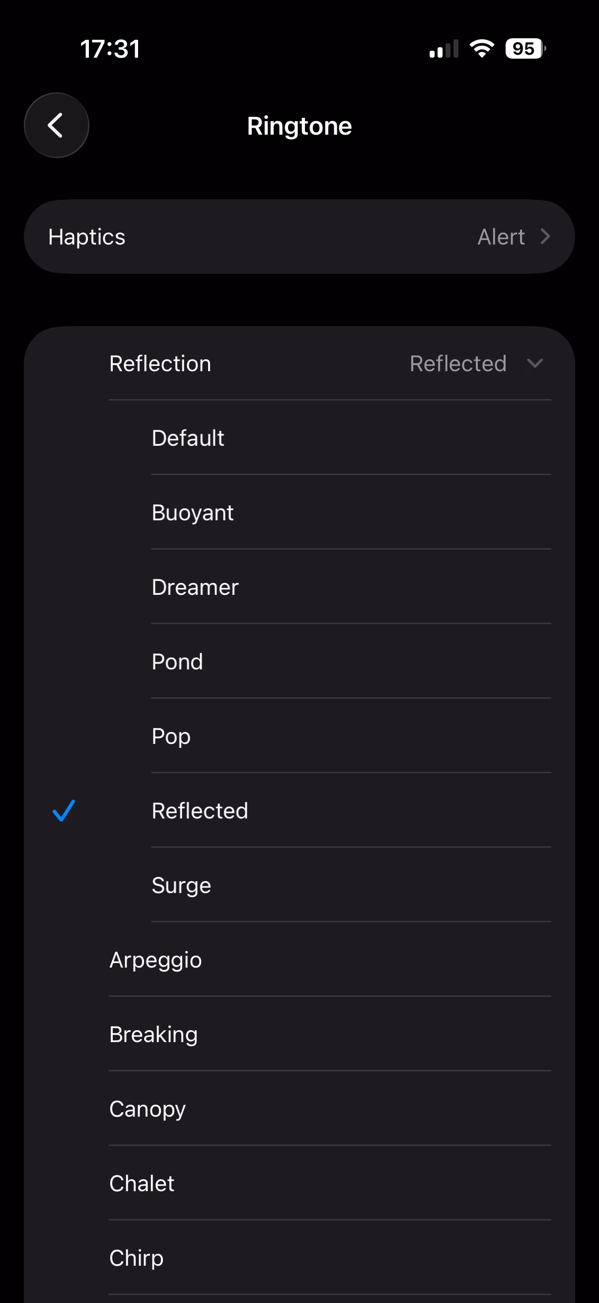
I found this weirdly delightful: There are a few new ringtones in iOS 26, but they’re not new new ringtones – they’re sort of “riffs,” or maybe remixes of a default Reflection ringtone.
If you don’t have an iPhone, here’s a short video where you can hear them. I’m guessing Apple sees the default ringtone as sort of an audio brand, and wants to invest in it more.
The only thing I don’t like are those names: It feels each one is following a different naming scheme.
(Side note: I am 180° from Gruber’s take on new Apple TV sonic logo. The previous one was better – recognizable and interesting. The new one is bland, milquetoast even. It instantly reminded me of the Windows 95 startup sound.)
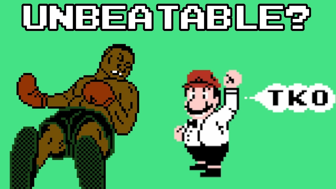
September 6, 2014, was a landmark day in speedrunning history.
I like Summoning Salt’s videos about speedrunners because they manage to add a great dose of storytelling to what otherwise would be boring, mundane events, and this one about Punch-Out is no exception. It’s Rocky meets Moneyball, in a way.
This pairs well with the previous review of the “Pilgrim in the microworld” book because speedrunning feels very connected to mastery and to quality – whether it’s because of the old-fashioned grind to be better, or by exploiting all sorts of glitches in the game to shave off sometimes milliseconds. The video above is in the former category, or what speedrunners would call “glitchless.” It’s also just really fun to watch. (The book wasn’t fun to read.)
If you’re new to learning about speedrunning/glitchless, this video about “rolling” in Tetris (which itself is kind of mindblowing), and then this one about new Tetris developments from aGameScout are a great entry point.
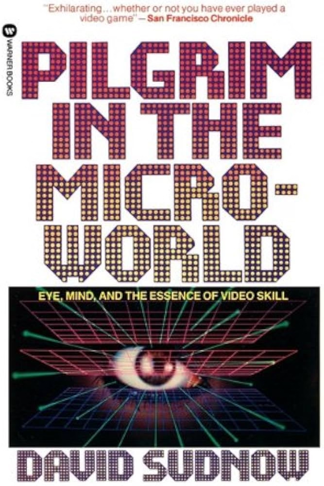
★★☆☆☆
This could have been an essay.
When I first learned about this book from Jacob Geller’s video just months ago, I thought this was another example in the vein of The Power Broker – a perfectly Marcin-coded book that somehow escaped me knowing about it for decades.
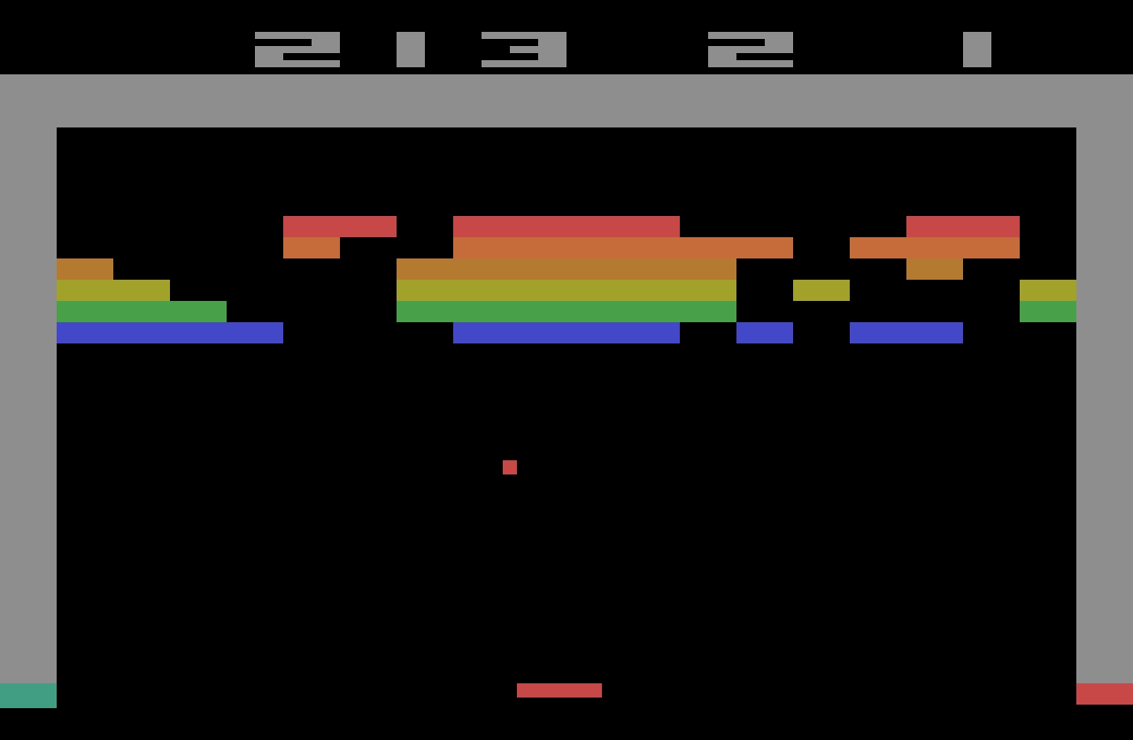
“Pilgrim” is from 1983, and is a story of a pianist discovering the classic videogame Breakout, and trying to perfect his own gameplay.
I love so many stories of videogame mastery, because at times they feel the closest we got to Doug Engelbart’s dream of incredibly effective machine operation somewhere deep below the threshold of consciousness: You and the computer becoming one, eyes and fingers forming feedback loops so perfect they cease to be noticeable.
Here I am alone in a pitch-black hotel room, a middle-aged man with some time to kill, getting ready to check out some jazz clubs in Greenwich Village, in possession of an early cretinous offering from a gold rush grab bag of tuby thingies coming our way from hundreds of decision-making puzzle peddlers throughout the new electric “entertainment” industry. And now instead of playing the game it‘s packaged up to be, I‘ve gotten into more or less occupying myself by outlining invisible triangles across the screen of a TV doodling machine. What am I doing?
Unfortunately, as you can maybe already sense, the book is an overwritten, ponderous, and pretentious mess. “Beach reading, it ain’t,” quipped a Kill Screen reviewer in 2013. But there are some interesting parts in it.
Before, the piano was the quintessential human instrument. Of all things exterior to the body, in its every detail it most enables our digital capacities to sequence delicate actions. Pushing the hand to its anatomical limit, it forces the development of strength and independence of movement for fourth and fifth fingers, for no other tool or task so deeply needed. This piano invites hands to fully live up to the huge amount of brain matter with which they participate, more there for them than any other body part. At this gnetically predestined instrument we thoroughly encircle ourselves within the finest capabilities of the organ.
Then a typewriter, speeding the process whereby speech becomes visible, the extraordinary keyboard for sequencing and articulating perhaps awaiting a still truer sounding board, strings, and tuning, a still more suited canvas for thought.
Then TV.
This arrives at page 26. Alas, it’s kind of downhill from here.
The author visits Atari (imagine that!) to learn that the programmer of Breakout doesn’t really understand what makes Breakout so alluring. The game perhaps lucked in to being so imminently playable, and then replayable.
I’m interested in designing for mastery. We should not rely on luck that separated a classic like Breakout from a hundred other games from that era that felt awful to play and were immediately forgotten.
Sure, Sudnow definitely takes Breakout way too seriously:
Maybe I can remember the five shots by putting pieces of tape on the TV cabinet to mark each paddle destination, I say to myself, even though it seems that would undercut true learning. It’s bad practice to learn the piano by writing the names of the notes on the keys, much better not to use a code, to grasp the layout of things by their own looks and feel. And I can’t carry Scotch tape to a Breakout tournament.
But in a way: why wouldn’t you?
In fact it’s already happening. I’ve found myself playing with the cursor on my word processor just for the hell of it, seeing if I could track it across screen and get it to stop at every comma in the text.
The word processor (or any other app you use often) operating at the speed of fingers unlocks superpowers, and then some.
There’s one experience in particular at the word processor that gets me downright angry at times. There’s no more of that room for finger breathing while you awaited a carriage’s return. You reach the end of a processed line of text and if your word becomes too long for the margin while there’s still alloted space to get it underway, it splits in the midst of your articulation and your voice instantaneously reappears six inches to the left, a quarter of an inch lower. The computer can’t know what you’re about to write, not yet, not a word or even a letter in advance, has to wait and merely calculate how things are going in order to then “decide” where to put the sound. ¶ Before, you felt a big word welling up, hit the carriage return, lifted off from the keyboard just a bit, reorganized your grasp, and dug back into the improvisation with a renewed rhythmic mobilization to continue. And some of the things you found to say, you found because you said them that way.
This was a fascinating tidbit, this reflection on how small interactions can change the nature of creative process.
If this book was cut to 20% of its size, those fascinating tidbits would stand out more, and the book would still be of value today.
But despite this complaint, I miss people writing about using computers this way. Such a big chunk of my struggle with computers today is fighting with it because I expect a better connection between my fingers and what’s happening onscreen.
I wish more designers understood how important that is.
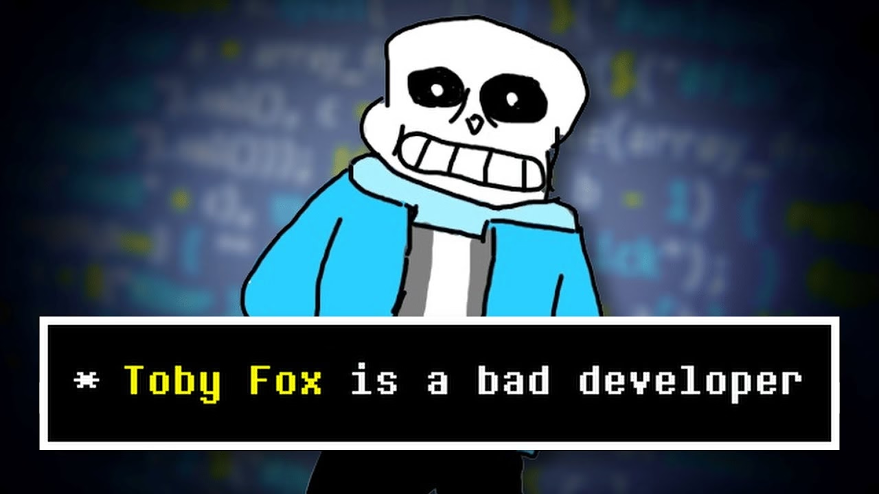
A fun and short video from Juniper Dev about how Undertale is a fantastic game despite being fantastically poorly written:
When you make dialogue in a video game you have a distinct file that has all the possible text that can pop up in your game. This is usually a CSV file, or a JSON, and you can think of it as basically a database for text. So then at different parts in your code, you extract specific parts of this file, and that’ll depend on what character you’re talking to, if you have a certain item, whatever, and that’s one of the most efficient and common ways to do it.
But the way that Undertale handles dialogue is much worse. All of the dialogue in the entire game, every text box that pops up, is handled in one massive if statement. […] case 737 out of what must have been at least 1,000 lines.
This reminded me a little of my first week with my personal computer, when I didn’t yet know you can write IF X <> 3 THEN, so I spent half a day writing statements like IF X = 1 OR X = 2 OR X = 4 OR X = 5…
Vibe coding was there long before AI.
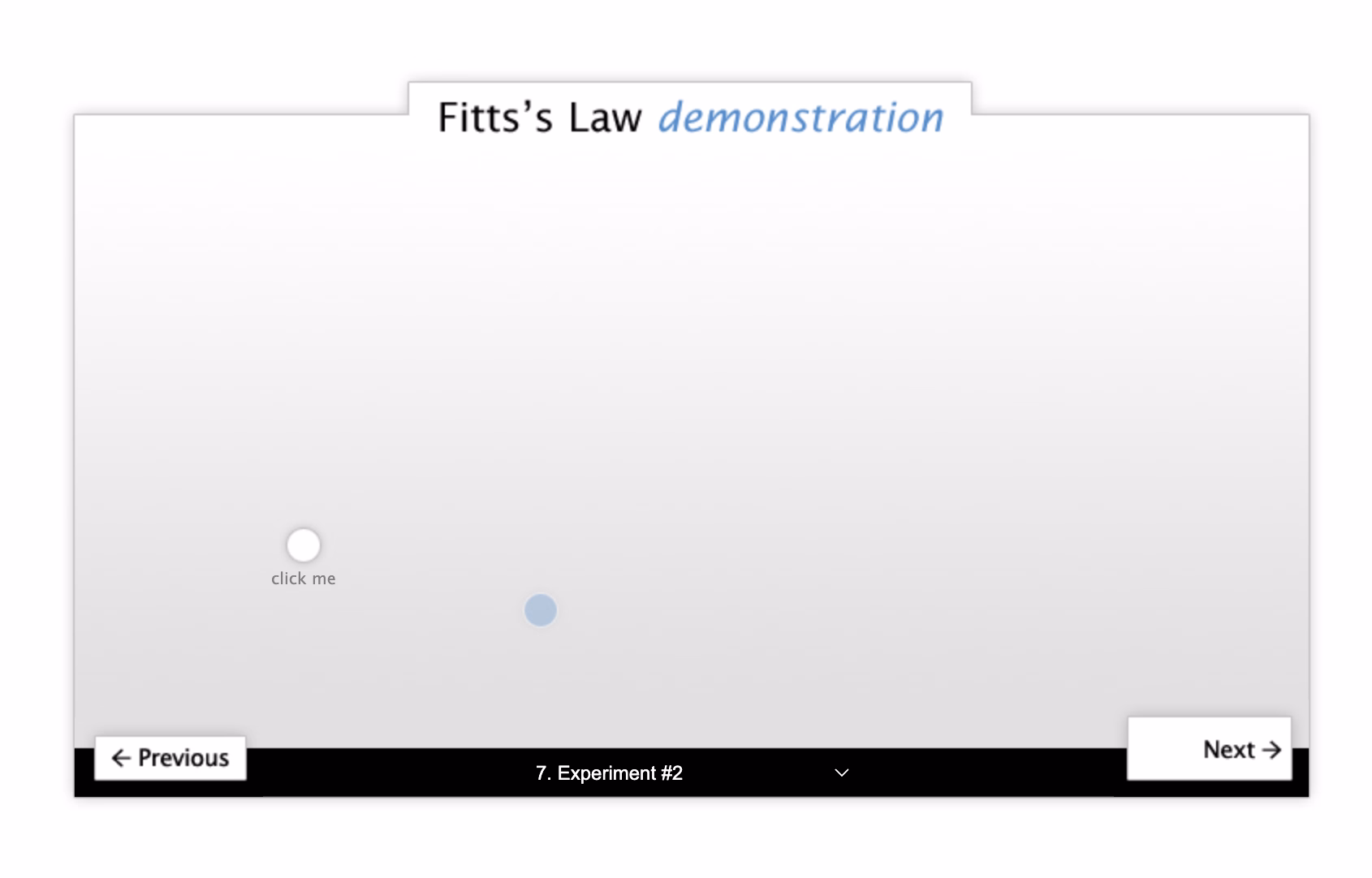
Just kidding. But it’s a happy 20th annivesary to the little interactive explainer I made of Fitts’ Law back in 2005!
It’s charming in a sort of early-web kinda way, but still holds up – at least on bigger screens. I even ran it on my iPad and it worked.
Every so often, a wonderful thing happens: someone young enough to have missed out on using computers in the early 1990s is introduced to the Windows 3.1 “Hot Dog Stand” color scheme.
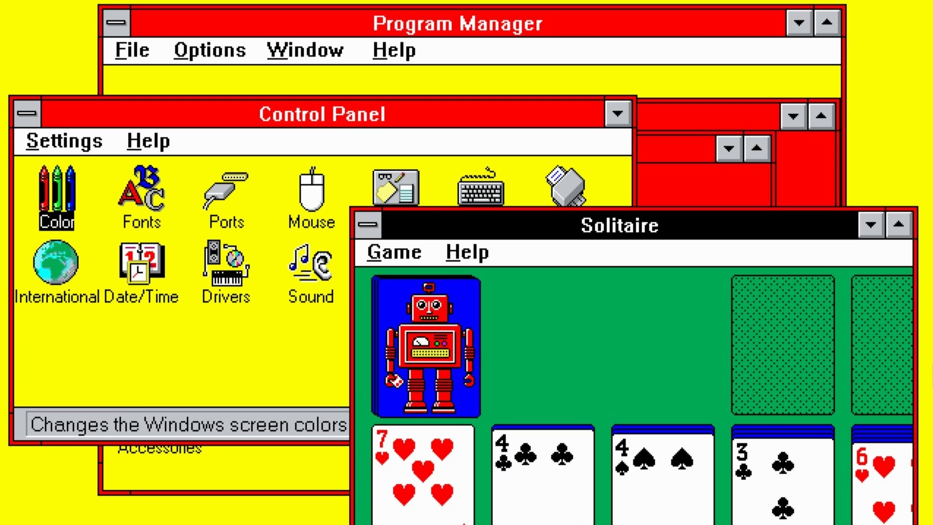
I can’t figure out whether Gruber’s take (“That’s Microsoft.”) is also a subtle jab at Apple in the year of Liquid Glass.
Also, great first comment under the original post:
I assume “Plasma Power Saver” served an actual purpose - it was intended for users of “portable” machines having a gas plasma display. Early ones were monochrome (orange) and I guess the actual color hue didn’t matter so much as the intensity.
Early plasma displays were genuinely fascinating.

Forgot about this cute little story:
It used to be that when you dragged an item off the Dock and dropped it, the icon would disappear in a puff of smoke and make a satisfying noise. The animation was strangely primitive against the backdrop of the slick user interface of what used to called Mac OS X.
I too wondered why that animation was weirdly amateurish, almost like a placeholder. Well,
One of the most talented engineers on the team took out a piece of paper. I wish I could say it was a napkin to make the story better. ¶ On the piece of paper, he drew a series of five frames. The intention of the designer was that these drawings would stoke further discussion. That it would get cleaned up and refined later. ¶ But that never happened. It shipped as is. And the rest is history.
Also when looking it up, I found a mention of a fascinating bug that exposed the origin of the animation as a sprite.
This is inside my Sony Alpha camera: a teensy too technical, or maybe slightly-lost-in-translation-from-Japanese message. I love it. It has personality without trying to be cute.
I just got my first Windows laptop in ages, and a little nervous to dig in, given the burgeoning reputation.
(My secret: I used to admire Windows in the 3.x and 9x and 2000 era because I always thought its keyboard operation was a lot better than Mac OS’s.)
I spend a lot of time at work thinking and designing (and avoiding) loading states, and someone just reminded me of a piece I wrote ten years ago, so I just moved it from Medium to my new website, and updated with new things I learned.
It’s about TV clock idents and what they meant to me growing up – possibly the original “loading state” in my life.
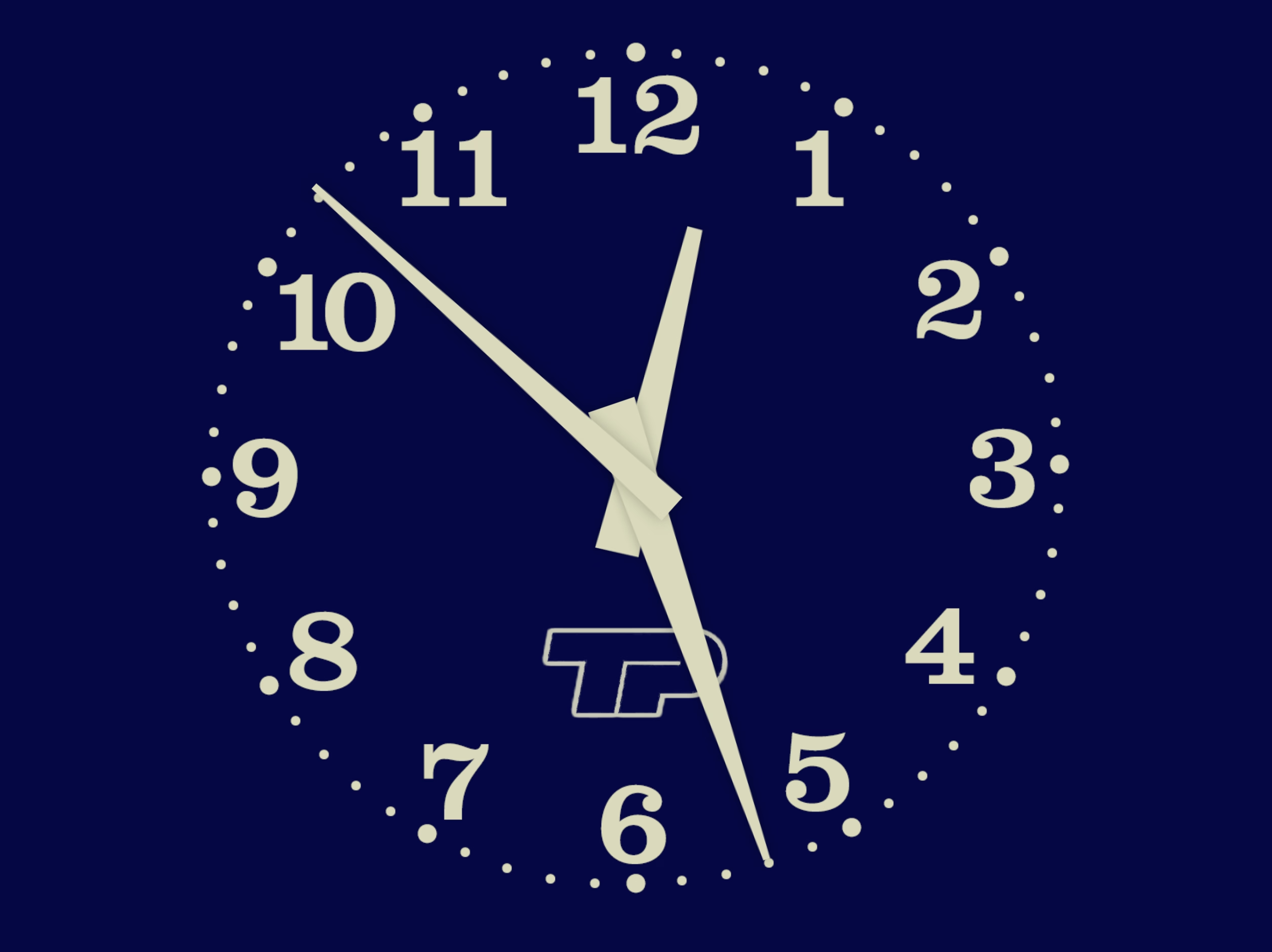
Of course, really, nothing compares to the absolutely banging BBC News “loading state”, which is fantastic, infinitely memeable, and brilliant even before you realize it cleverly incorporates the historical Greenwich Time Signal in it in a way that absolutely gives me chills.
Best comment under that BBC News theme: “As a swiss, this makes me proud to be british.”
What is it about Brits and extraordinarily perfectly timed music? Here’s Pet Shop Boys and Casting a shadow, made especially for and matching the total solar eclipse in 2000 to within half a second.
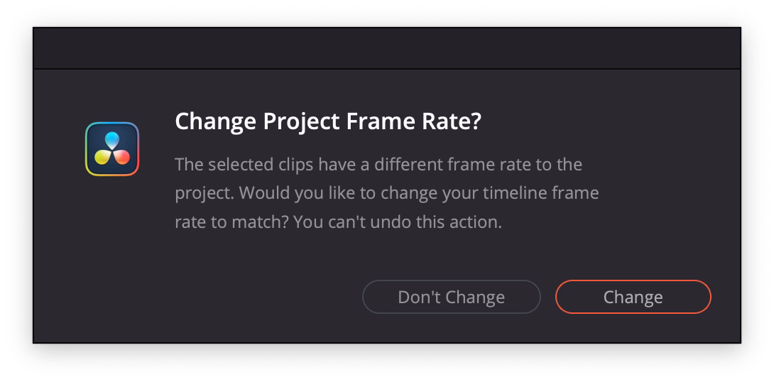
An extremely thoughtful moment in DaVinci Resolve. When you drop the first video clip into a new project, it suggests to update the settings of the entire project, on the correct assumption that the first media might set the tone of the whole thing.
“You can’t undo this action” is scary and kind of… untrue? But I’ve stopped reading by then. I press Enter and it saves me a trip to a complex project settings dialog box I always forget the location of.
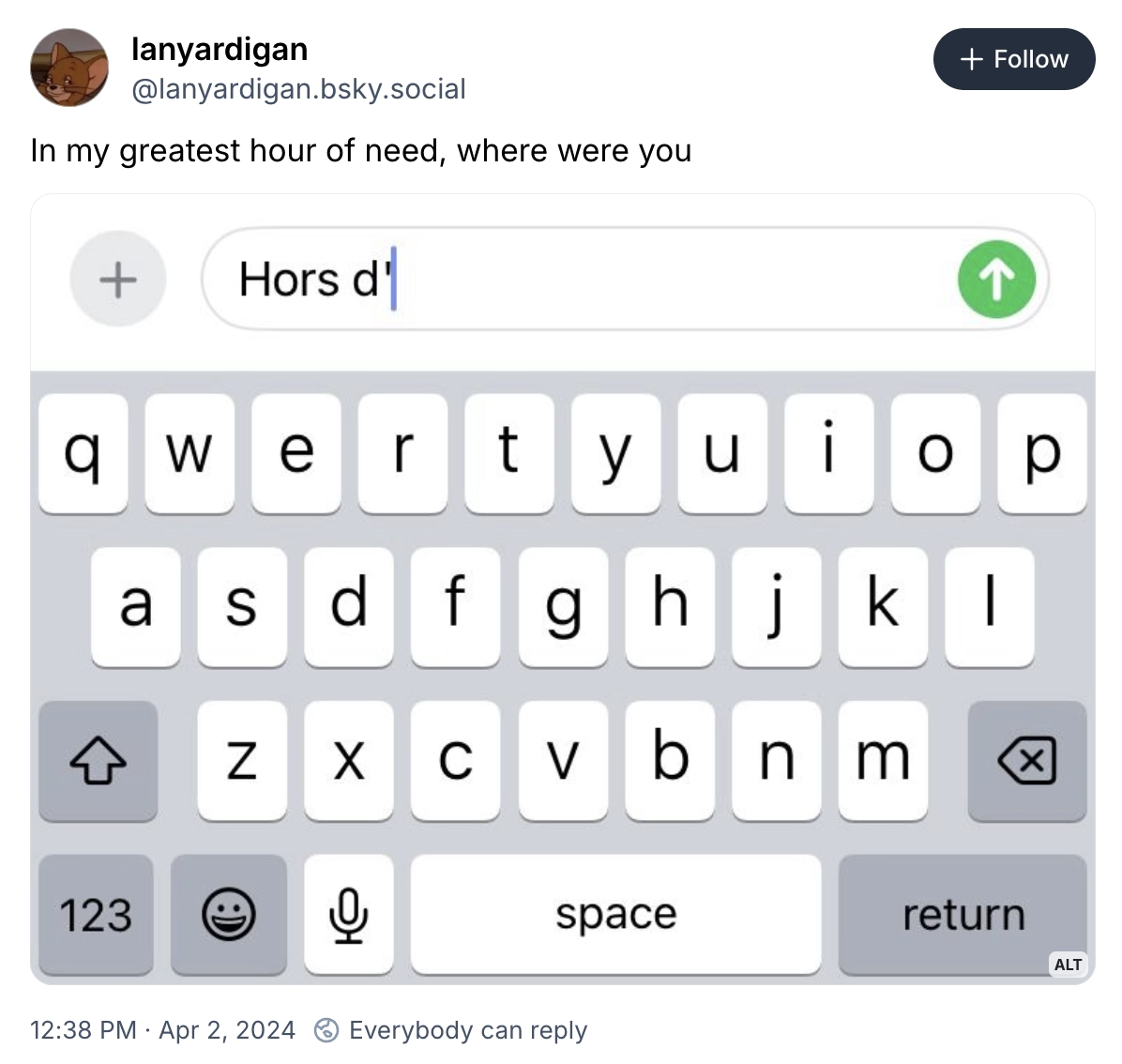
Made me laugh. lanyardigan on Bluesky:
From the vantage point of 2025, optimization is clearly no longer a priority for the tech platforms. Google’s search results have gotten worse. Google doesn’t care. Facebook is awash in AI slop. It welcomes the slop. Amazon is filled with fake products and fake reviews. All of these companies still dominate their categories. Degrading the user experience isn’t costing them. The motivating belief that these companies had to optimize, or else they would be out-competed, no longer drives Silicon Valley behavior. Optimization was an era. That era has ended.
Hidden inside that essay is also a link to The Resonant Computing Manifesto, with this good paragraph:
Most of us got into tech with an earnest desire to leave the world better than we found it. But the incentives and cultural norms of the tech industry have coalesced around the logic of hyper-scale. It’s become monolithic, magnetic, all-encompassing—an environment that shapes all who step foot there. While the business results are undeniable, so too are the downstream effects on humanity.
I’ve always been curious whether those “dyslexic-friendly” fonts amount to anything, and this 2022 post I haven’t seen before puts this idea to rest:
But the new fonts—and the odd assortment of paraphernalia that came before them—assume that dyslexia is a visual problem rooted in imprecise letter recognition. That’s a myth, explains Joanne Pierson, a speech-language pathologist at the University of Michigan. “Contrary to popular belief, the core problem in dyslexia is not reversing letters (although it can be an indicator),” she writes. The difficulty lies in identifying the discrete units of sound that make up words and “matching those individual sounds to the letters and combinations of letters in order to read and spell.”
(via Daring Fireball, whom I quoted for the title, via Jens Kutílek, whose fonts I use)
From Dmytro Tovstokoryi at Mintlify:
I recently joined Mintlify as a part-time design engineer. […] I started a daily thread sharing UI fixes and improvements that I was shipping. I also invited people to share any UI bugs they noticed.
People responded. I fixed things in near real-time. It was fun and I learned a lot.
I enjoy little posts with updates like this.
(However, a small thing: I wouldn’t use text-shadow this way. It’s veering into the territory of faux bolding, and looks bad. And, in this case, it feels like it’s not solving a problem.)
Computers Are Bad is an acquired taste and I’m acquiring it. This was an excellent post going deep into the myths and anti-myths of elevator close door buttons, and pedestrian crossing buttons. I love storytelling + rigor:
First, anyone who says that the “door close” buttons in elevators are routinely “not even hooked up” shouldn’t be trusted. The world is full of many elevators and I’m sure some can be found with mechanically non-functional door close buttons, but the issue should be infrequent. The “door close” button is required to operate the elevator in fire service mode, which disables automatic closing of the doors entirely so that the elevator does not leave a firefighter stranded. Fire service mode must be tested as part of the regular inspection of the elevator (ASME A17.1-2019, but implemented through various state and local codes). Therefore, elevators with a “door close” button that isn’t “hooked up” will fail their annual inspections.
Also, this bit was delightful:
The software, as I recall, came from the school of industrial software design where a major component of the interface was a large tree view of every option and discoverability came in the form of some items being in ALL CAPS.
From Scott Jenson’s 2021 post about Tesla 3 interface, this is so clever (emphasis mine):
Edward Tufte has this visual rule that 1+1=3: With a single line on the screen, you have just that single object, but adding a second line does something interesting, it adds a third ‘object’ on the screen, the negative space between the two. All good visual designers deeply understand this effect.
In UX design we have a cognitive equivalent. If you have two buttons, there is a third ‘object’ created: the decision a user must make on which button to tap.
Appreciate little moments showing utmost keyboard orientation in Raycast.
The millisecond you hover over the back button, the app says “you should be using the keyboard for this”:
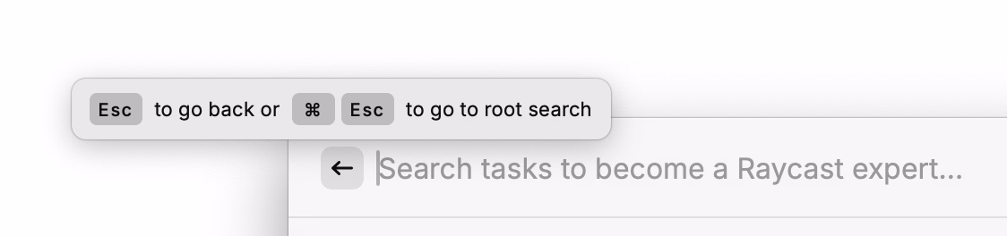
I am not sure you often see tooltips on buttons, with keyboard shortcuts only:
Every select menu – even those with literally two options – has an inline search:
Party like it’s 1983! Or 1982! Or 1967!
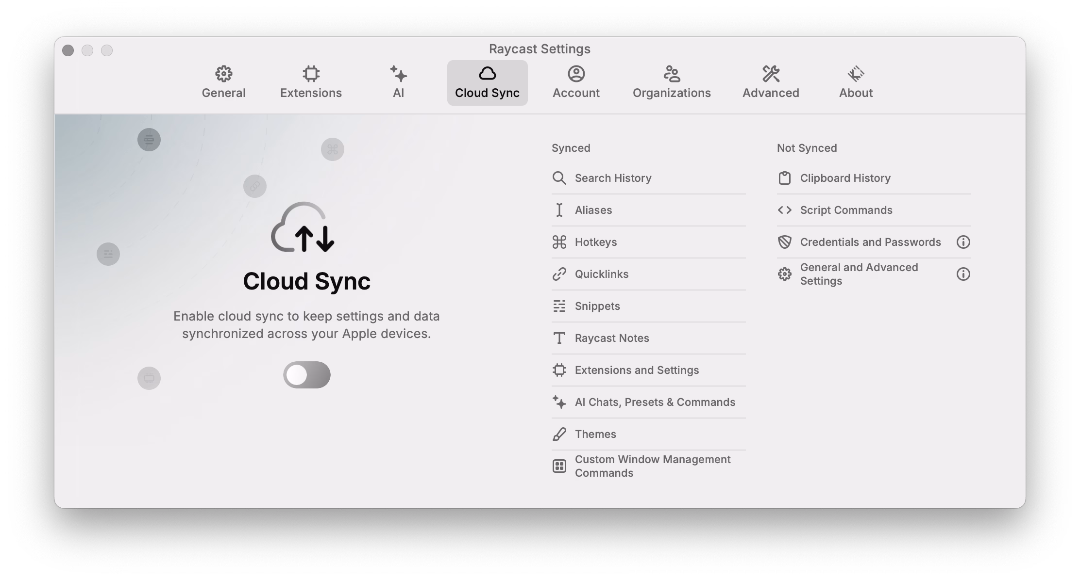
Also, unrelated, love the clarity of this panel. This is what’s synced. This is what’s not.
Evergreen and inspiring from Craig Mod, a 2019 plea for fast software:
Google Maps is dying a tragic, public death by a thousand cuts of slowness. Google has added animations all over Google Maps. They are nice individually, but in aggregate they are very slow. Google Maps used to be a fast, focused tool. It’s now quite bovine. If you push the wrong button, it moos. Clunky, you could say. Overly complex. Unnecessarily layered. Perhaps it’s trying to do too much? To back out of certain modes — directions, for example — a user may have to tap four or five different areas and endure as many slow animations.
Funnily enough, I feel that way about Apple Maps. I abandoned is since small things felt heavy, mired in superfluous swipey animations that felt like driving a 1960s car. Luckily, this was at the time Google Maps redesign its tiles to match Apple’s, so I got what I wanted to begin with, although in a slightly shady way.
I miss Sublime Text and might take it again for a spin (VS Code and Atom felt slow, Nova is delightful but also struggles in performance, even on simple things).
I miss Notes feeling lightning fast.
A good post by Jim Nielsen about icons in menus (in Tahoe).
This posture lends itself to a practice where designers have an attitude of “I need an icon to fill up this space” instead of an attitude of “Does the addition of a icon here, and the cognitive load of parsing and understanding it, help or hurt how someone would use this menu system?”
It seems a necessary ingredient of introducing icons to menus is thoughtfulness and guidance around when the icons are necessary/useful and when not.
It doesn’t help that the Tahoe icons seems to mess up indentation. (I haven’t updated to Tahoe and might skip it altogether. Even just the planetary-scale rounded corners are something that feels very broken.)
An absolutely eviscerating 18-minute walkthrough of Apple Music for macOS Catalina, from a few years ago. More funny than anything else, but a reminder to test the “boring” edges of your app – like a state with a lapsed subscription, or coming back after a few months.
There’s no way to drag and drop. […] If I want to add this to here, I have to go through this bullshit, and when I do, it takes seconds again.
Also, an ode to a well-functioning back button, and well-behaving loading states. Those things add up so quickly.
(My debugging brain understood what populated the confusing History entries – I bet it was the early play sequences that went through a bunch of stuff without playing.)
I gave a talk about the craft of pixel fonts at Config last year, and this fresh YouTube video by Noodle seems to be a great and quirky companion to the whole issue of “how did pixels look on old CRTs,” including many examples from modern games.
A really interesting convention I just spotted in DevonThink that shows the shortcuts as soon as you hold ⌘, although it feels a bit clunky and cheap in execution.
(The main worry here for me would be that it’s distracting if you already know the shortcuts. I haven’t noticed it disappear if you use it, but maybe it does after a while.)
Tom Forsyth wrote about a fun bug in a Half-Life 2 reissue, of a particular flavour I have never heard before.
So I started it up, selected new game, played the intro section. It’s a fairly well-known section - you arrive at the train station with a message from Breen, a guard makes you pick up a can, and then you have to go into a room and... uh... I got stuck. I wasn’t dead, I just couldn’t go anywhere. I was stuck in a corridor with a guard, and nowhere to go. Bizarre.
Fascinating quick walkthrough of Strudel on TikTok from DJ_Dave (sound on!). Sometimes you see an interface and you immediately just sense how efficient and fun and powerful it is, without ever touching it.
Very bretvictorian in a way. Also related: a recent video from Benn Jordan walking through obscure music software used by Aphex Twin.
From Nina Kalinina’s excellent revival of a forgotten 1983 GUI, a discovery of a hilarious accessibility bug:
VisiOn loves to beep at the user. It beeps every time a menu option is chosen or an on-screen button is clicked.
If you are tired of the noise, you’d appreciate that Application Manager has an option to replace the sound with a “visual beep”. It is implemented as a flashing area of 32x16 pixels around the mouse cursor. Every time the flashing is about to happen, an image “below” the cursor is preserved in RAM to be restored after the “visual beep” is over. However, the memory allocated for this bitmap is never freed. It takes between 200 and 1000 clicks to fill the RAM with useless copies of the mouse cursor, and then the system crashes.
If you have never heard of VisiOn, The Digital Antiquarian has a fun walkthrough that also happens to be the first chapter of an excellent series about the history of graphical user interfaces.
It reinforces my belief that teams need a culture that values attention to detail when building products. Tiny annoyances so often get neglected as we rush to ship, but the consequences accumulate, souring the whole brand. It’s not a long journey from “Ugh, these AirTags…” to “Apple has lost their way…”
But in my experience, those rough edges seldom go unnoticed by someone, somewhere, who was unable to stop the momentum of a product release for such an “insignificant” flaw. Or, even more consequentially, they did not feel it was safe to do so.
I want to quote so much of this essay, so I’m going to do just that.
I’ve always felt that culture is made of the accumulation of small acts of gracious leadership: acknowledging moments of bravery during a retro, teasing out a reticent comment during a product review, and on and on. It can come from other places too, but it is most effective when it comes from the top.
If you’re leading a team remember: Never criminalize pride in craft.
I think the fact that Liquid Glass is worse on MacOS than it is on iOS is not just a factor of iOS being Apple’s most popular, most profitable, most important platform — and thus garnering more of Apple’s internal attention. I think it’s also about the fact that the Mac interface, with multiple windows, bigger displays, and more complexity, demands more nuanced, more expert, interaction design skills. Things like depth, layering, and unambiguous indications of input focus are important aspects of any platform. But they’re more important on the platform which, by design, shoulders more complexity.
A great read – harsh, but deserved. It’s good to punch up. I don’t have a lot of context on Alan Dye, but the parts that resonated the most was appreciation of the craft of interface and interaction design for complex things. iOS has had occasional sprinklings of great interaction design, especially in its physics-based gestures that blossomed since iPhone X. macOS feels abandoned in this regard, with even hard-won victories like fast Finder and great user preferences deteriorating.
But here’s what modern UI design looks like: There’s always a confusing title; it doesn’t quickly tell me what to do or what it wants me to understand; beneath that there’s a subtitle, explaining the title again; beneath that there’s several sentences that restates the title and subtitle but simply jumbles all the words around to make it justify its existence; then the button—there is always a button—and it asks me to “Confirm” or “Apply” but as to what I’m confirming or applying I have absolutely no idea unless I go back to the text and fight my way through it all again.
Kept nodding through this whole essay. I don’t love nervous user interfaces that share their own problems and insecurities with their users. I love confident interfaces that know exactly what to say, and don’t outstay their welcome.